
DONNA BELLA
PRODUCT LAUNCH
CREATIVE DIRECTION & DESIGN - MARKETING CAMPAIGN
SENIOR GRAPHIC DESIGNER - BEAUTY INDUSTRY GROUP LLC (FULL-TIME)
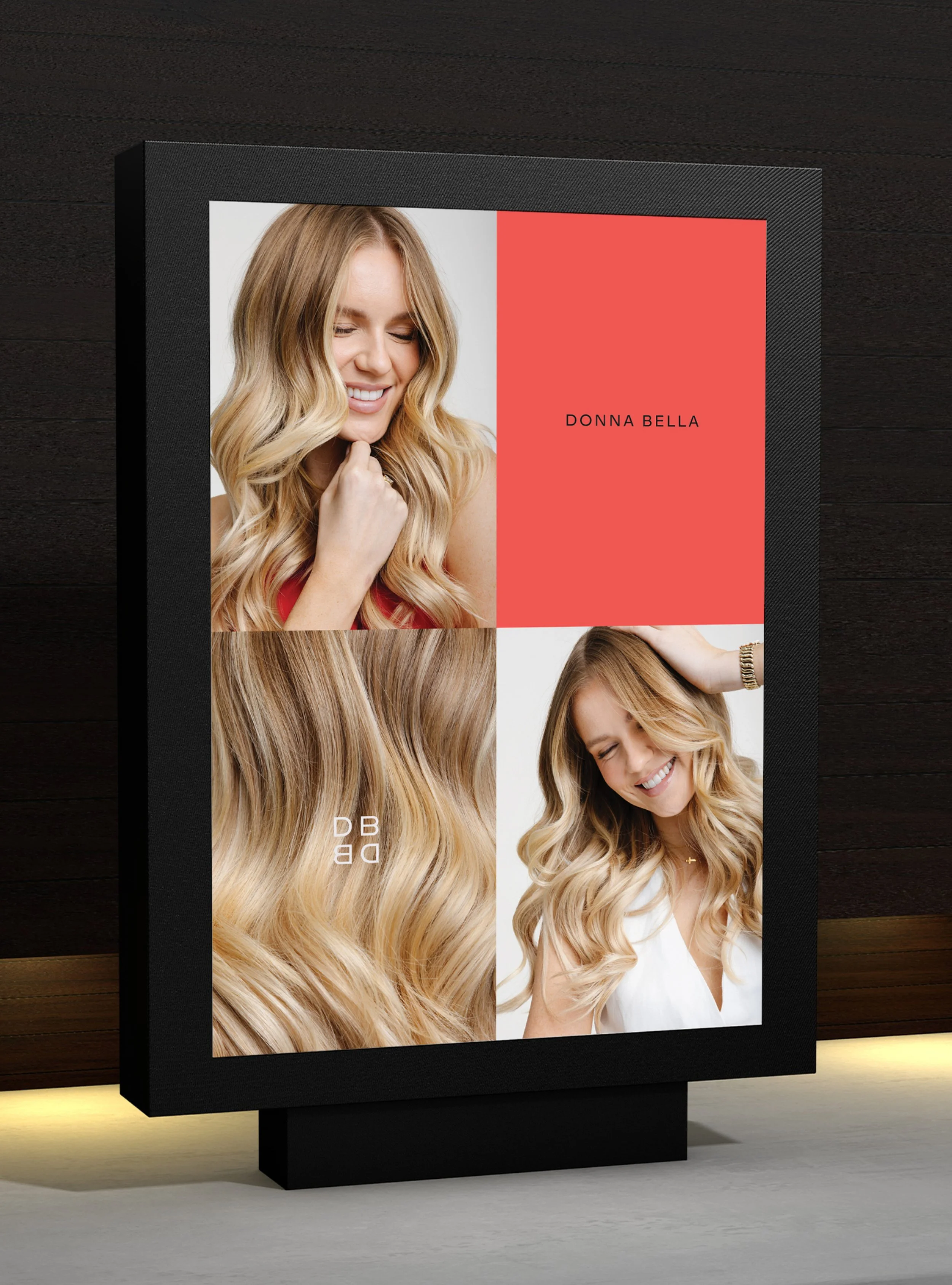
I was given the opportunity to creative direct and design the launch campaign for the Donna Bella Reverse Weft, with the goal of introducing the product through bold editorial storytelling and playful visual communication. The campaign reiterated the new brand identity by implementing evergreen design aspects that defined the visual language, embodied the new art direction, and exemplified how the new branding should be adapted across channels. Simultaneously, the campaign aimed to build anticipation, facilitate customer comprehension, and drive growth through strategic use of imagery, typography and information design.


PROJECT DETAILS
CREATIVE DIRECTION & DESIGN - DONNA BELLA CAMPAIGN
JAN - FEB 2025
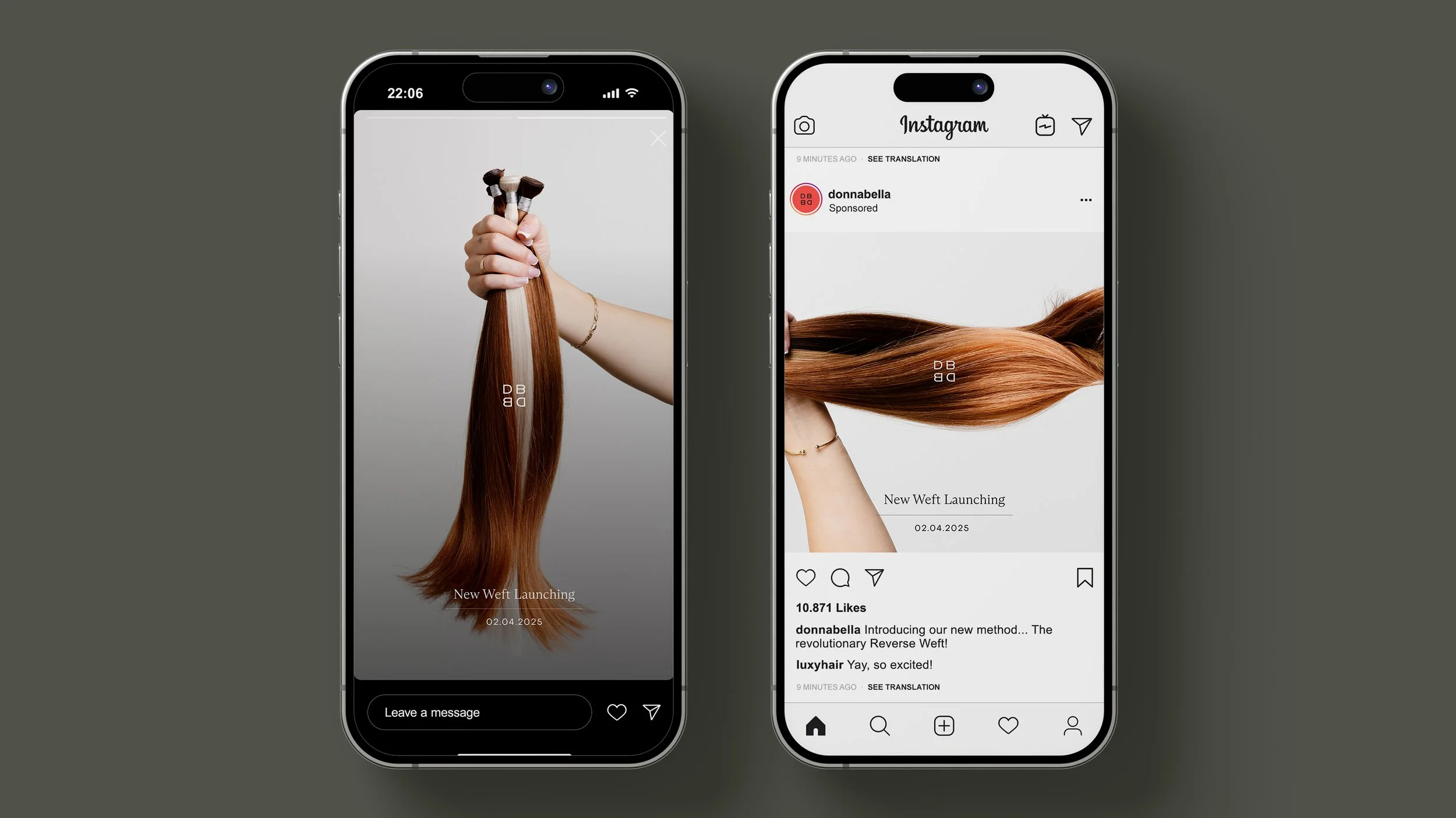
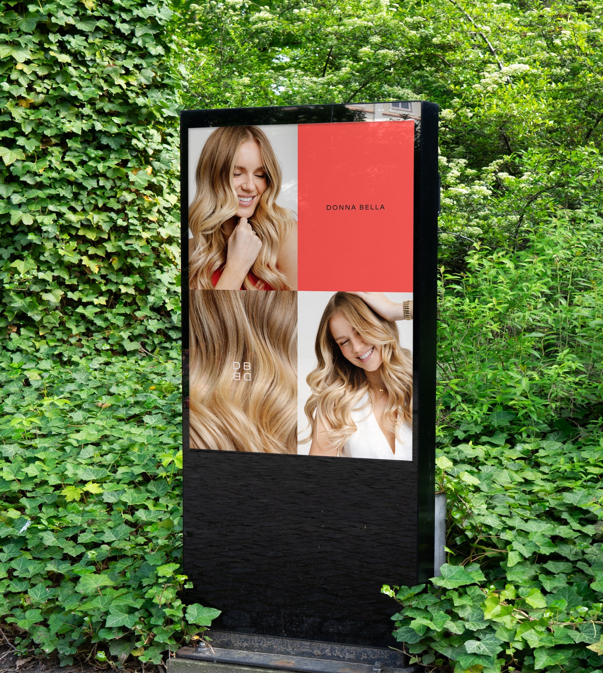
This product launch campaign was implemented out across all channels including paid advertisements, organic social, email marketing and print design.
Donna Bella’s brand identity was designed by RoAndCo Design Studio in New York**
-
The experience I gained while creative directing the implementation of Donna Bella’s new brand identity equipped me to lead the design and creative direction for the subsequent Reverse Weft product launch campaign. Because this innovation debuted shortly after the brand rollout, I proposed an evergreen design concept to reinforce the refreshed aesthetic, strengthen brand awareness, and maintain consistency across customer touchpoints. Simultaneously, the campaign aimed to build anticipation, facilitate customer comprehension, and drive growth through strategic use of imagery, typography and information design.
-
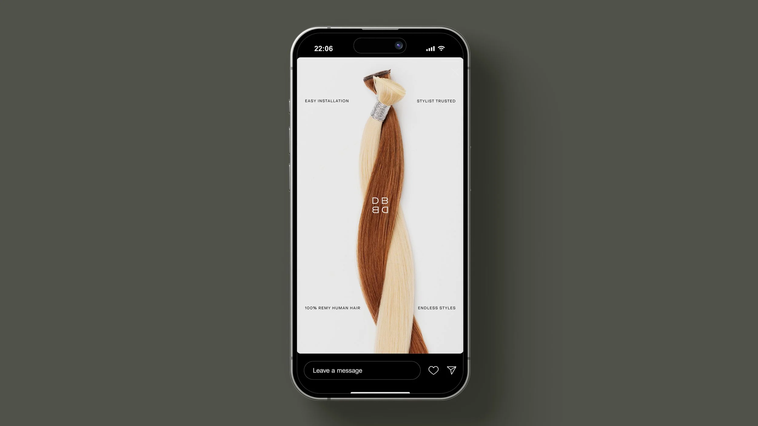
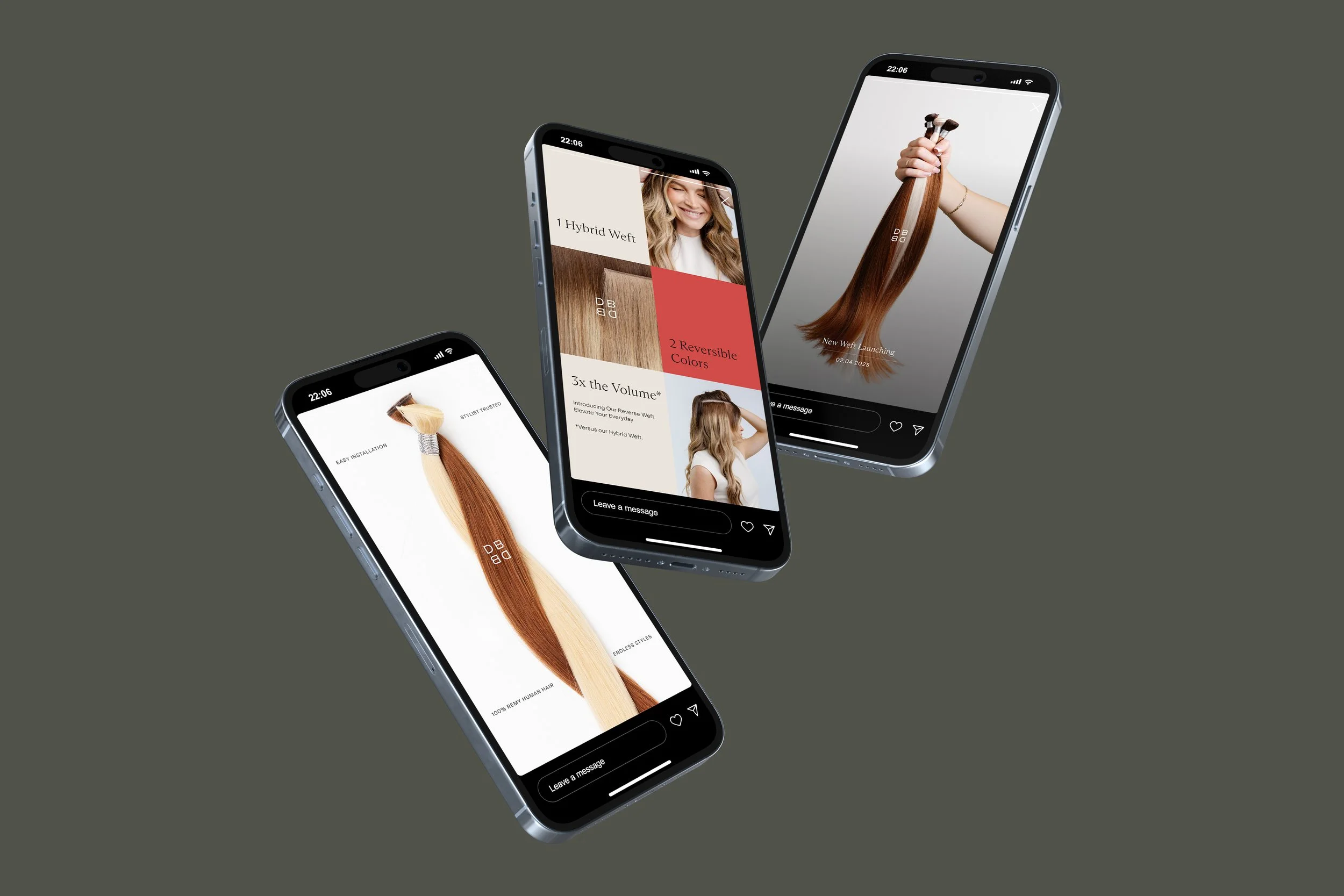
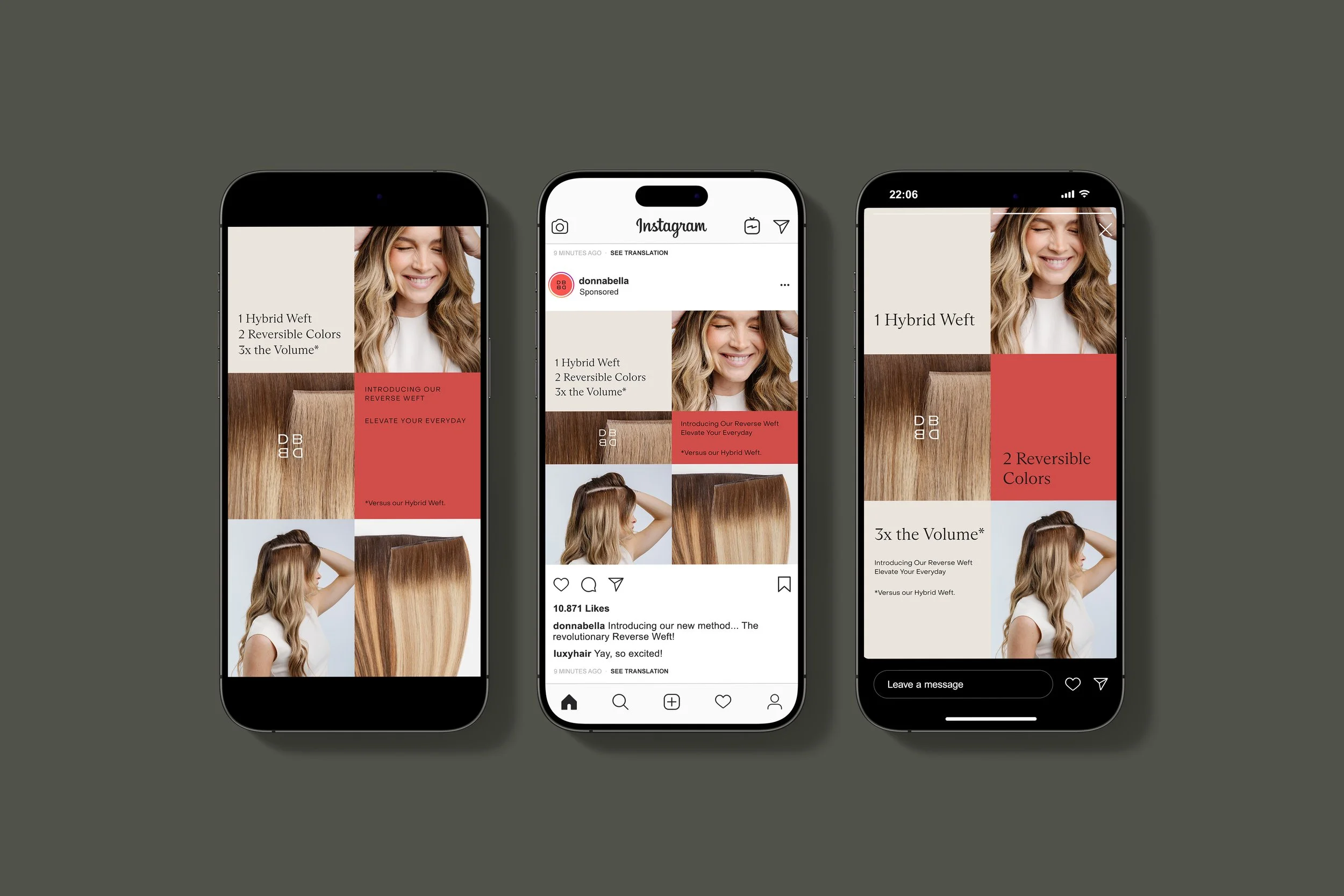
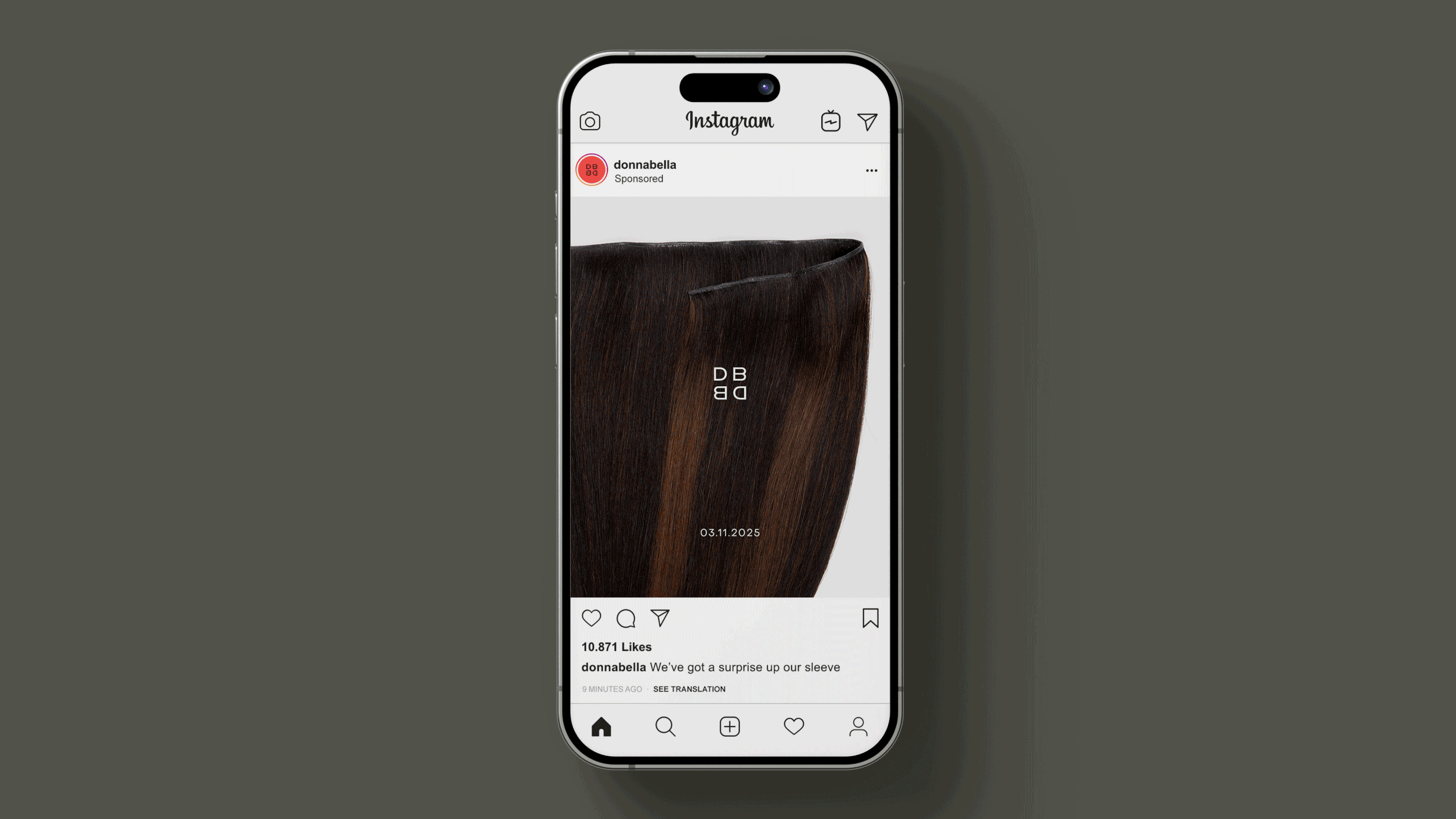
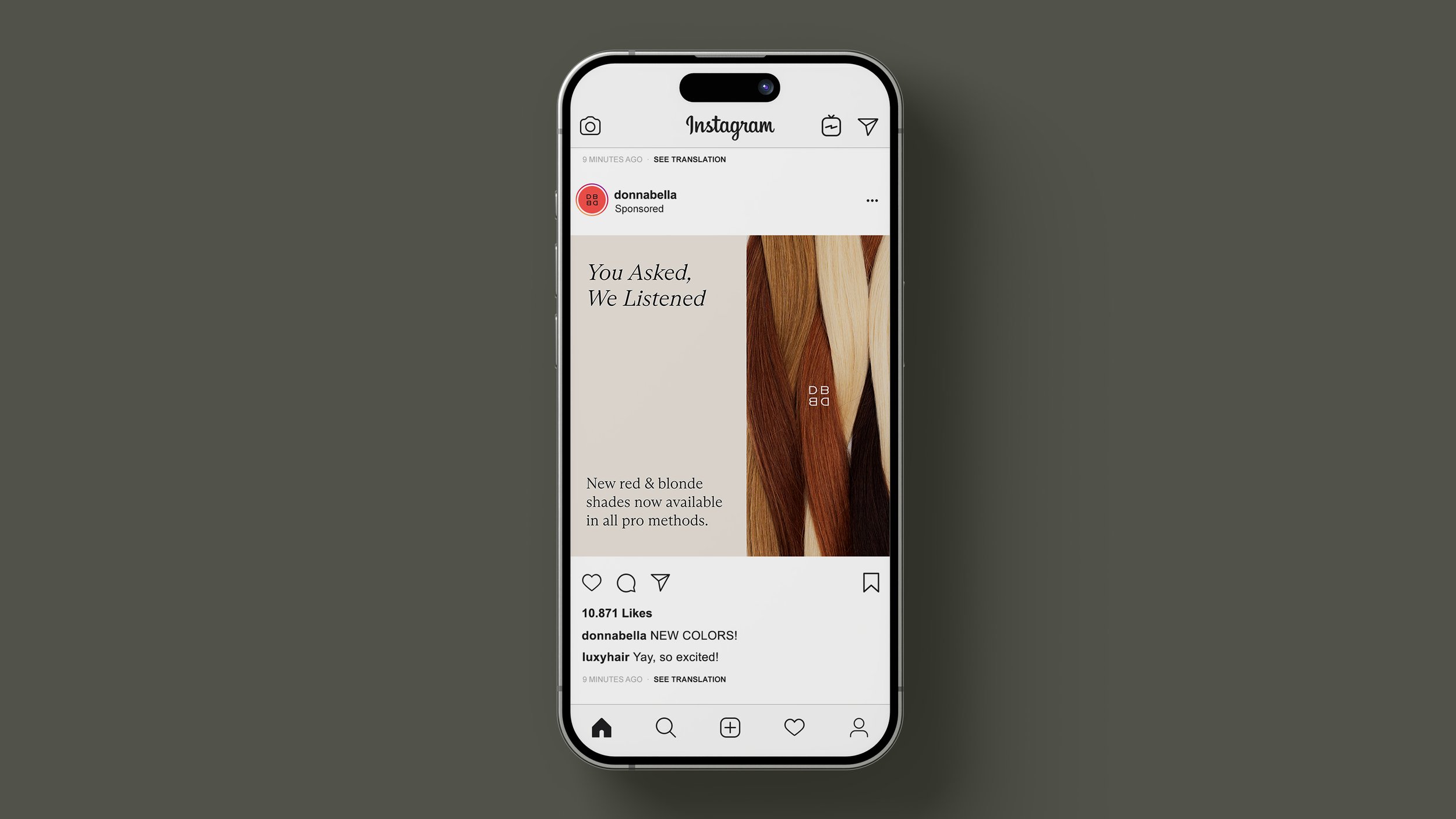
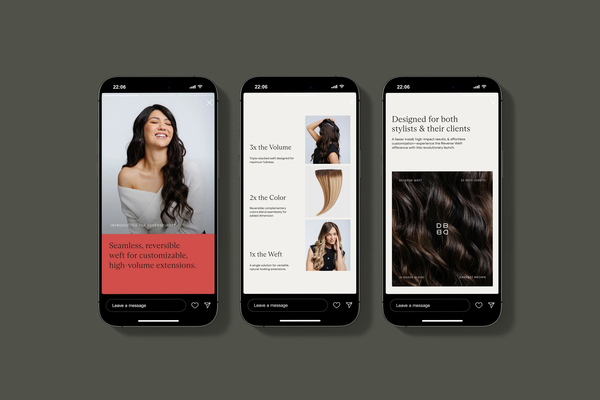
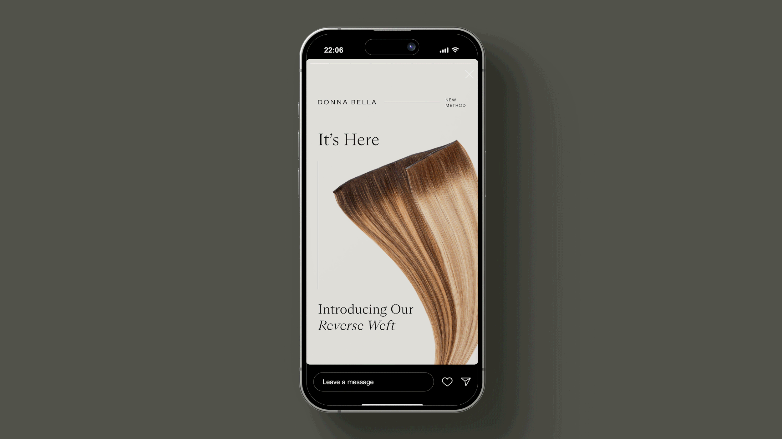
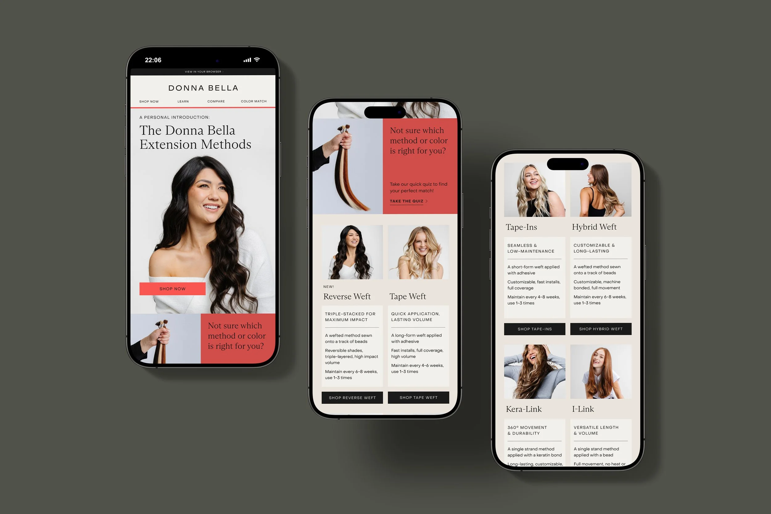
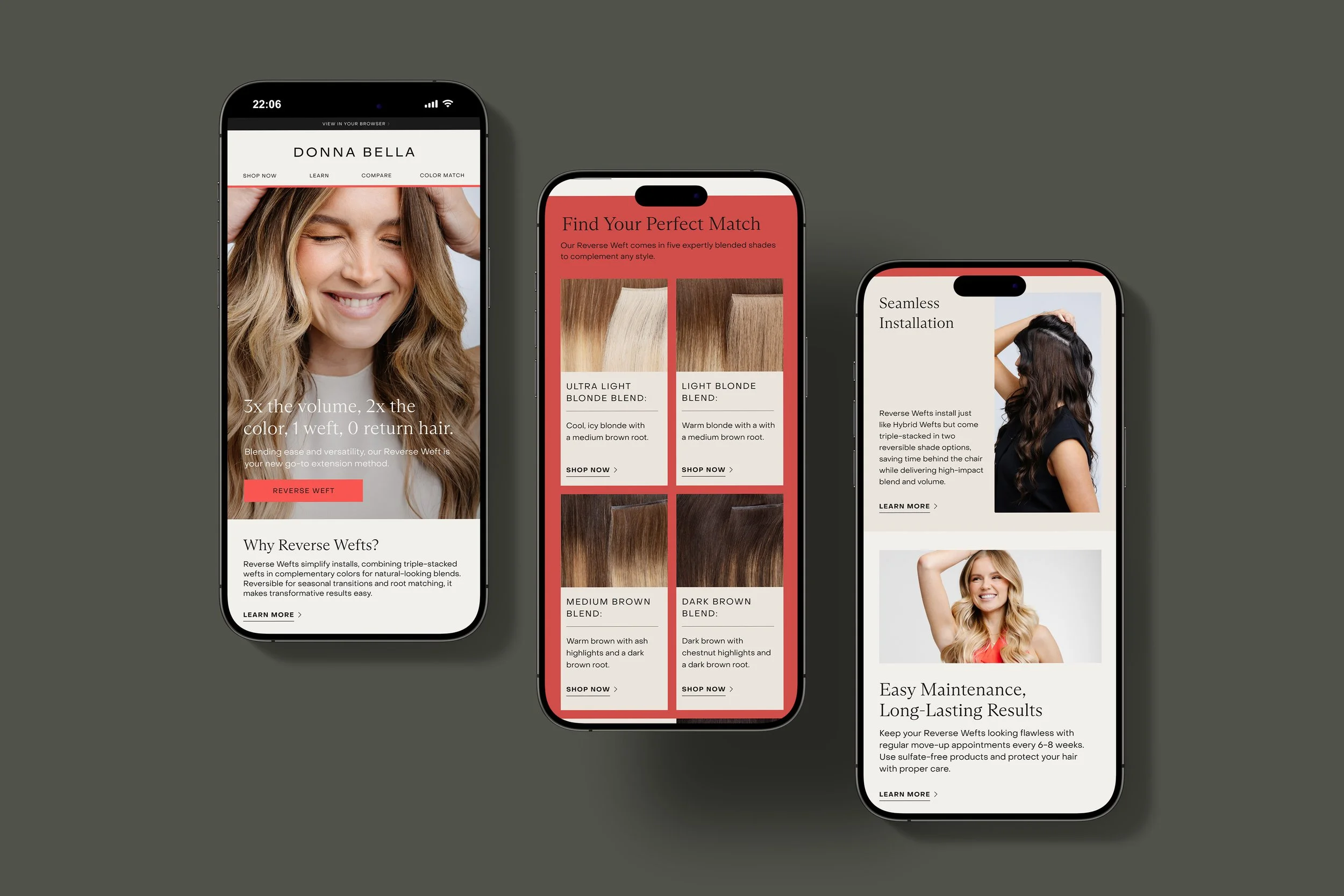
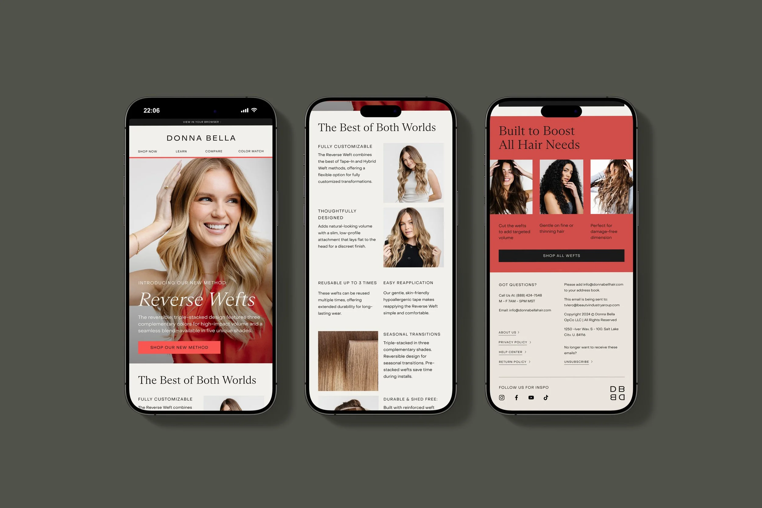
The Reverse Weft is an entirely new extension method that revolutionizes the category by offering a reversible solution for seasonal transitions, regrowth and customizable transformations. To introduce this innovation, we relied on strategic information design and imagery that clearly communicated the product’s benefits while reinforcing the new brand identity. Launching shortly after the rebrand, the campaign reaffirmed Donna Bella’s position as an industry leader in quality, innovation, and now design. Post-launch KPIs demonstrated strong traction, improved retention, and overall growth—validating the design-led approach and its market impact.
-
The primary audience for this campaign mirrors Donna Bella’s overall demographic—women ages 25+ seeking salon-quality hair with ease. Targeting both stylists and consumers, the campaign introduced the new method and brand identity to all audiences, regardless of industry knowledge. By emphasizing product education through brand-driven design, it appealed to savvy consumers who value high-quality, flexible solutions. The Reverse Weft fills a market gap for both professionals and everyday users, offering a reversible option ideal for seasonal transitions, regrowth, added volume, or blending.
-
This campaign sought to highlight Donna Bella’s innovation, strengthen the refreshed visual language, and drive brand recognition across the market. The creative direction positioned the Reverse Weft as a must-have solution to common consumer challenges, emphasizing versatility and ease. Through refined information design, bold typography, and intentional imagery, the campaign clarified product comprehension while embodying the elevated essence of the new brand identity.
-
With the rebrand newly implemented, this campaign presented an opportunity to solidify the new identity across channels and establish evergreen design standards. KPIs demonstrated traction among target audiences and reflected overall growth, validating my initial design decisions, informing the creative direction of our evergreen assets, and underscoring the importance of prioritizing aesthetic consistency during this foundational phase of the new identity. To meet the objectives of the marketing, sales, brand, and e-commerce teams, I developed a unified visual solution that emphasized information design through intentional typography, imagery aligned with the new art direction, and a bold use of color to convey editorial sensibility and elegance. I collaborated cross-functionally to provide assets, guidelines, and requirements for the simultaneous rollout across all channels, including website updates, digital and print advertising, social media, in-store materials, trade show collateral, and packaging.
-
The campaign reiterated Donna Bella’s refreshed brand identity while introducing the innovative Reverse Weft. Adaptable evergreen design concepts were applied that exemplified the brand aesthetic, communicated the desired brand sentiment, and were widely versatile across mediums as a result of intentional & consistent application of layouts, logo placement, colors, etc. By emphasizing editorial imagery, strategic typography, and bold color, the campaign achieved the goals of multiple internal teams while reinforcing the core brand message: Donna Bella empowers consumers to embrace confidence with salon-worthy results. This design-led approach drove initial sales, built demand, retained customers, attracted new audiences, and supported long-term brand growth.
-
This project was created in collaboration with the Donna Bella Brand Marketing Team at Beauty Industry Group (B.I.G. LLC), the in-house Copywriting Team, RoAndCo Studio for brand identity design, and 1R Agency for website development.
< PREVIOUS