
DONNA BELLA
PACKAGING DESIGN
CREATIVE DIRECTION & DESIGN - PACKAGING
SENIOR GRAPHIC DESIGNER - BEAUTY INDUSTRY GROUP LLC (FULL-TIME)
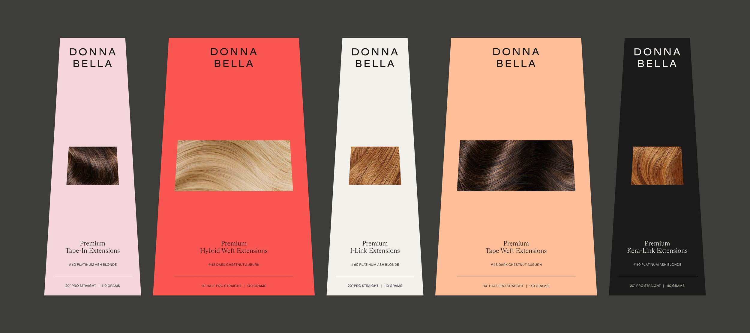
I had the opportunity to creative direct and design new packaging components for all 300+ of Donna Bella’s existing hair products, with the goal of exemplifying the new visual identity and communicating the brand’s elevated, editorial sentiment through its most tangible customer touchpoint. The re-imagined packaging aimed to achieve industry innovation through striking visuals, audience-focused appeal, and improved sustainability and functionality across diverse retail environments — from online and direct-to-stylist sales to anticipated in-store placement in 2026. To support this, I introduced a brand color and hair extension method association system that was applied across all assets, creating a bold, intentional, and cohesive brand experience. I prioritized a packaging concept that not only reflected the elegance of the new brand identity but also leveraged this brand color system to enhance customer comprehension, product discovery, and selection.


PROJECT DETAILS
CREATIVE DIRECTION & DESIGN - DONNA BELLA PACKAGING
AUG - NOV 2024
New packaging designs and components for all 300+ Donna Bella hair products & accessories to support the launch of the new brand identity.
Donna Bella’s brand identity was designed by RoAndCo Design Studio in New York**
-
Packaging played a pivotal role in establishing Donna Bella’s new brand identity, serving as the most tangible point of connection between the customer and the brand through sight, touch, and visual experience. While the packaging needed to hold the same products and communicate the same information as before, every aspect — from layout to component to visual hierarchy — was completely reimagined to embody the refreshed brand aesthetic. I also identified and sourced premium materials and finishes that elevated the tactile experience while prioritizing sustainability.
-
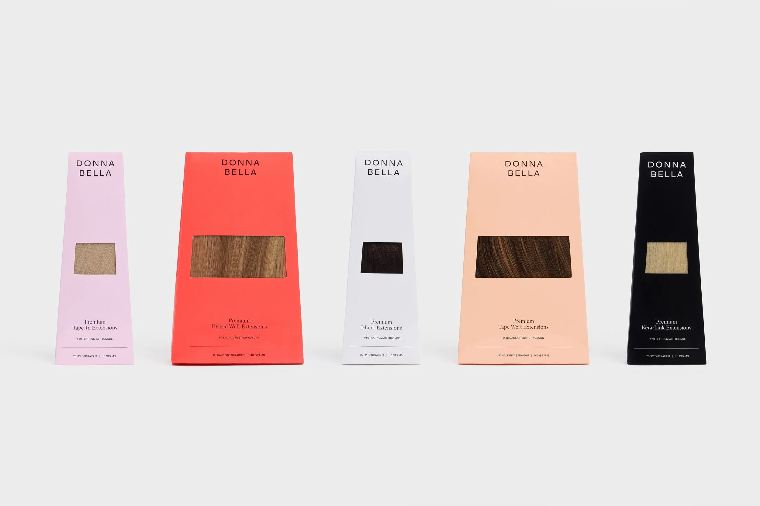
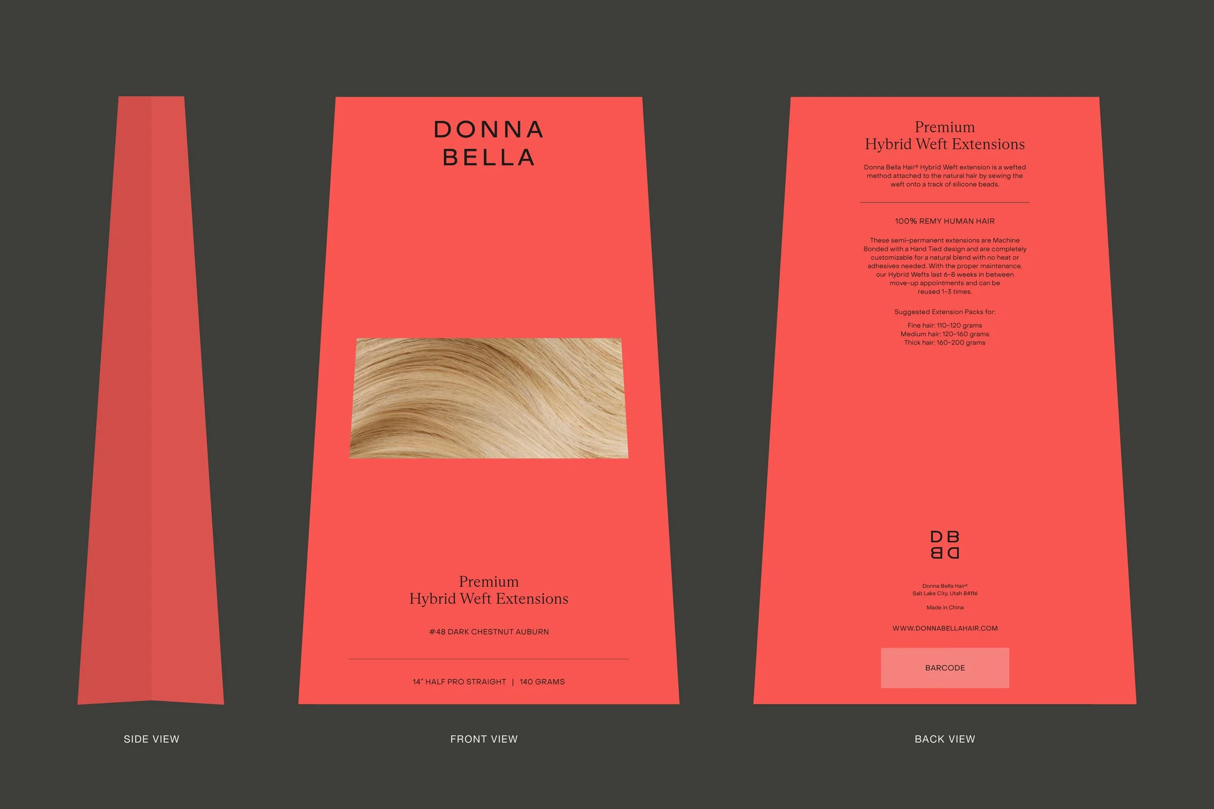
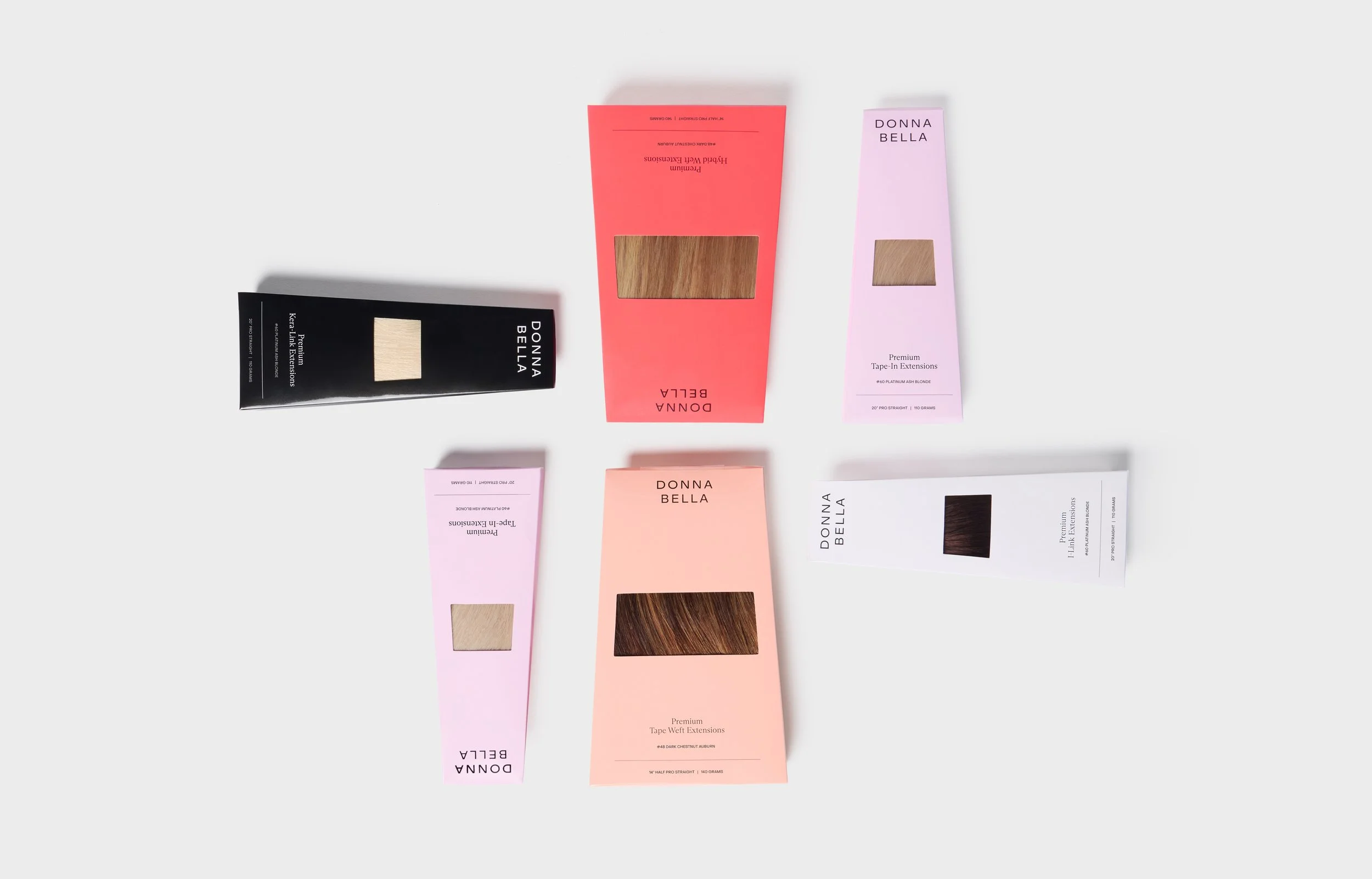
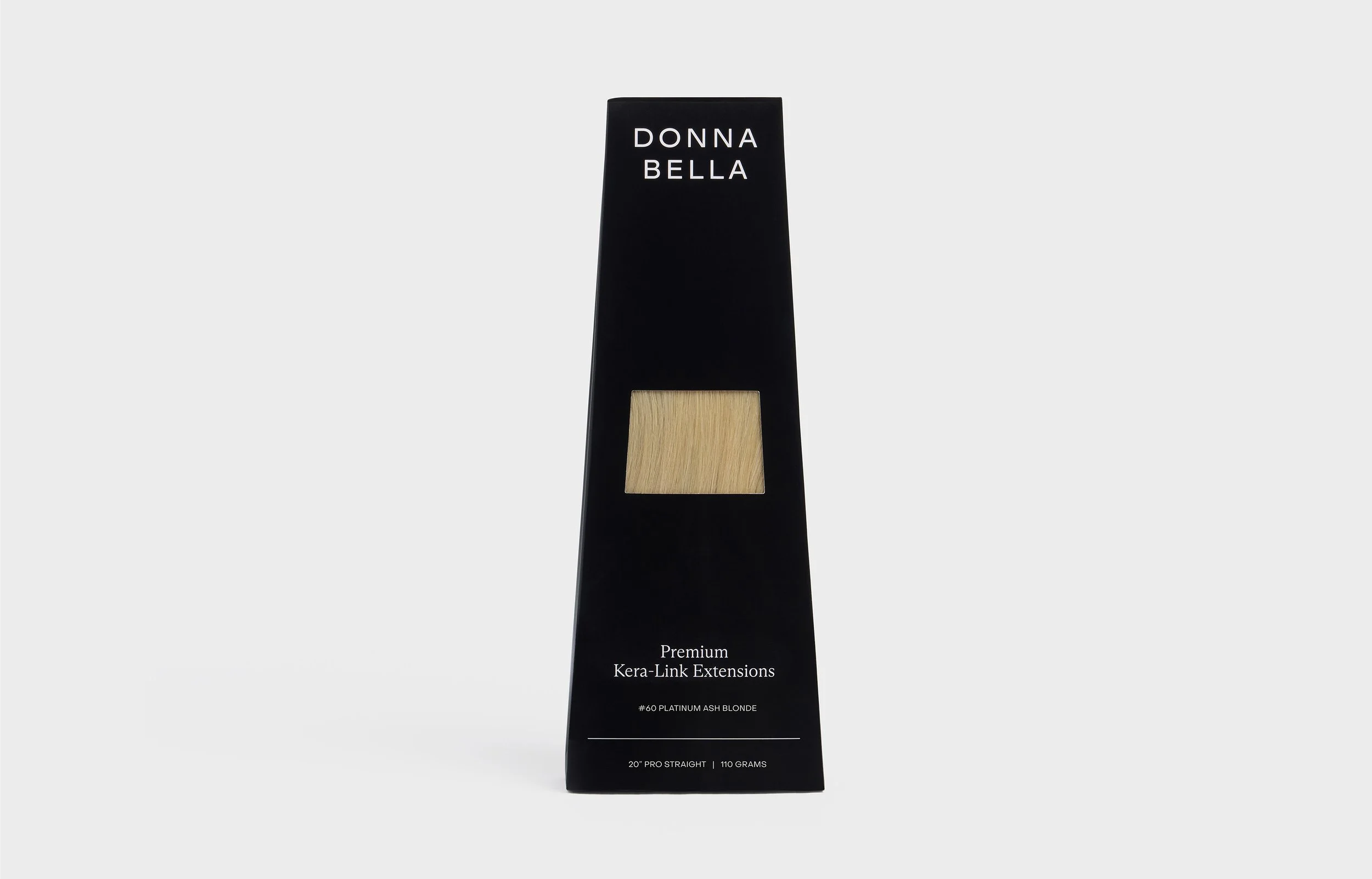
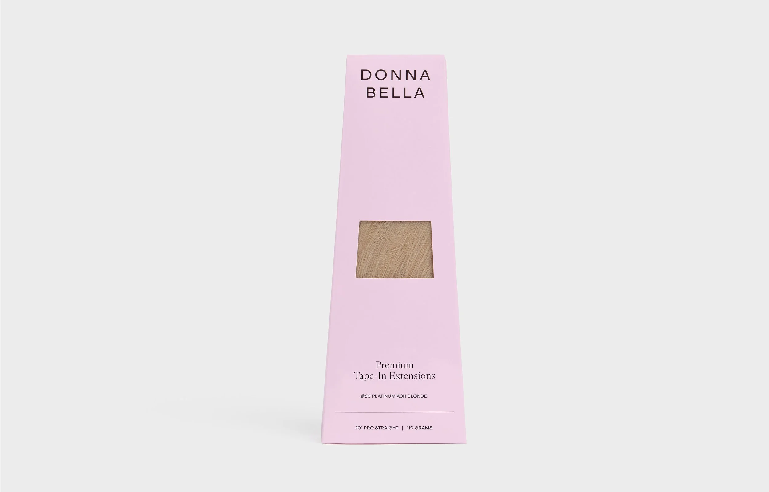
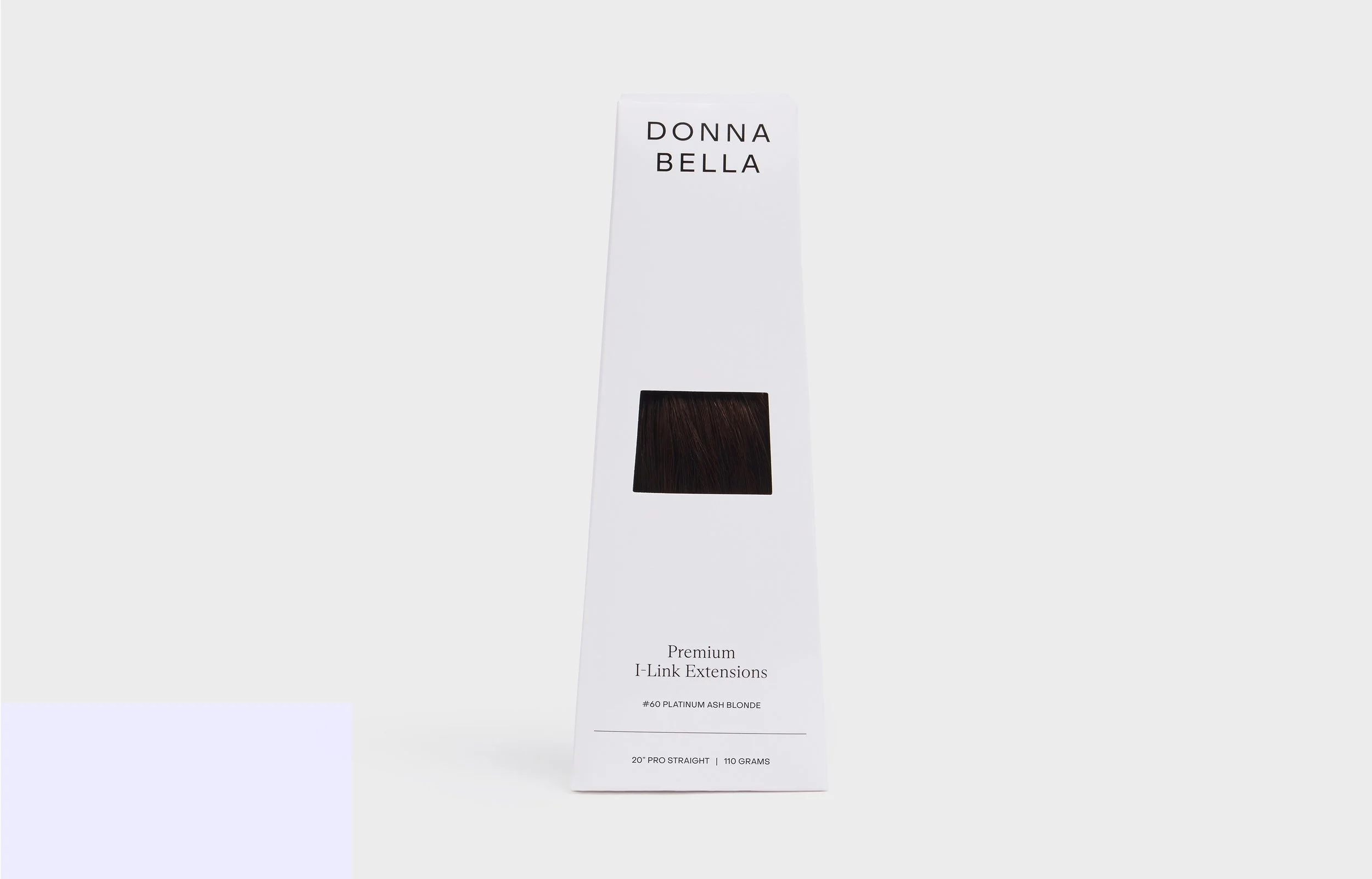
Given our broad audience and the upcoming expansion into retail, I aimed to create packaging that was innovative, durable, and visually striking — ensuring that it would remain consistent and polished whether displayed in salons, shipped directly, or featured on store shelves. It was essential that our visual displays are unique, striking, elevated and imaginative. Drawing inspiration from unique component shapes in the high-fashion industry, I collaborated closely with our packaging and warehouse teams to develop a tapered box design that could both protect and beautifully showcase the product while simultaneously conveying a bold design statement.
-
Donna Bella’s products reach a diverse audience — sold online, directly to salons, and anticipated to enter retail stores in 2026. With this knowledge, I wanted the packaging design to catch the consumers eye by utilizing bold color while clearly establishing the aesthetic of the brand. Targeting primarily women ages 20–45 within mid- to high-end consumer segments, it was essential to select materials that conveyed a sense of luxury while maintaining a bright, distinctive design to elevate brand awareness and visibility in a competitive beauty retail environment.
-
We referenced packaging examples in the high fashion industry for inspiration regarding sustainable materials & finishes that felt refined, elevated, and luxurious. Ultimately, we selected a tapered box with a wider base for the primary packaging — a shape that allows the hair to hang naturally while incorporating a clear window for product visibility. Beyond its functional benefits, this unique component design adds distinction and sophistication, reinforcing the brand’s elevated positioning.
-
After collaborating with RoAndCo on the Donna Bella rebrand, I began concepting how the new identity could translate into packaging. After design exploration, I introduced the concept of a brand color and hair extension method association system before finalizing the new tapered bag component. Following brand approval, I partnered with packaging specialists to source sustainable materials and coordinate production logistics. This involved close collaboration with the Donna Bella brand team, the internal production team at Beauty Industry Group (B.I.G. LLC), selected factories, and warehouse teams to ensure a seamless, high-quality execution across all sales channels — salons, retail, warehouses, e-commerce, distribution & internal processing (returns / exchanges).
-
This project involved close collaboration with multiple teams and partners, including the packaging team at Beauty Industry Group (B.I.G. LLC), the Donna Bella brand team, B.I.G.-owned and operated warehouses, several overseas packaging factories, the in-house copywriting team, and RoAndCo Studio — the creative agency behind the brand identity design.
< PREVIOUS