
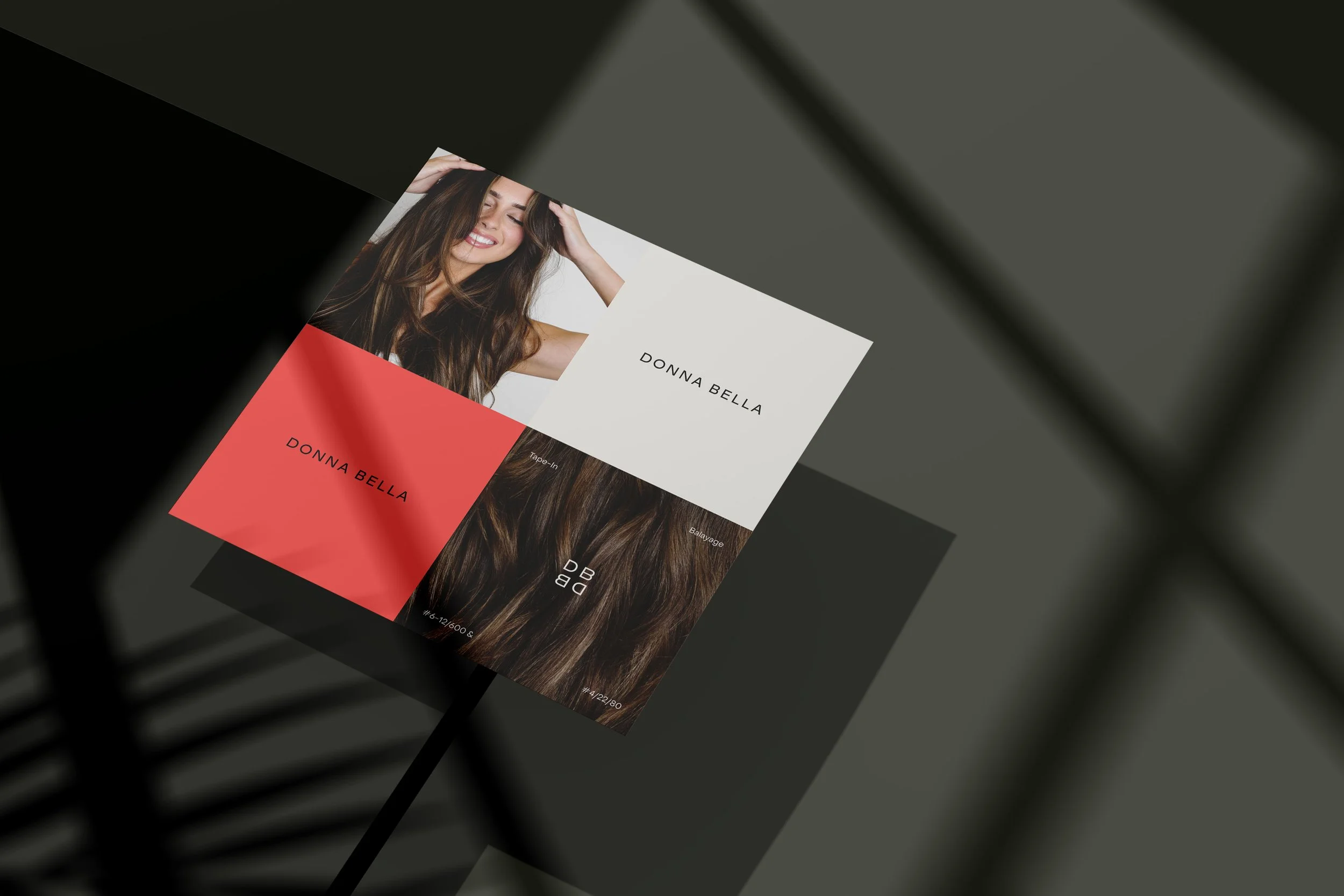
DONNA BELLA- REBRAND
Donna Bella is a trusted name in the beauty industry, providing the highest quality hair products and accessories to both consumers and stylists. These top-tier hair extensions / products have been able to carve their way in the industry since 2003 by providing quality and innovation- however prior to 2024, the brand was in desperate need of a cohesive, elevated, re-imagined brand identity that conveyed this caliber. I was given the opportunity to work with the design agency RoAndCo alongside the Donna Bella Brand team to conceptualize their new brand identity that is exemplified below. After the initial brand guide was completed, I was then given the opportunity to creative direct the implementation of the new identity and to design the brand assets necessary to bring the new vision to life across all channels.

NEW BRAND IDENTITY - ALL CHANNELS
Creative Brief
Work with RoAndCo and the Donna Bella Brand Team to conceptualize, create and refine a new brand identity that communicates the desired sophisticated, timeless, innovative, striking sentiment through design. Creative Direct the adaptation of this brand guide and curate the translation across all touchpoints to preserve the essence and aesthetic of the new identity and ensure that this desired sentiment is conveyed through all brand assets. Design all of the new brand assets necessary to establish the new brand identity, evoking ___,___,___ through intentional, consistent usage of the new wordmark, secondary mark, typography, and colors.
Client
Donna Bella
Timeline
End of Q3-Q4 2024
Project
13
Company
Beauty Industry Group (B.I.G. LLC)
13
2024
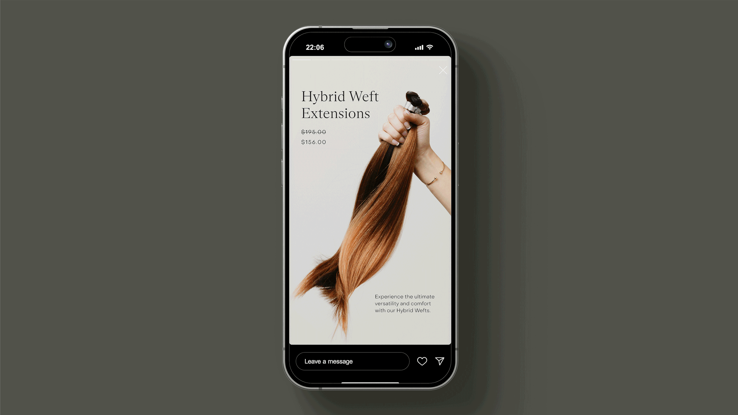
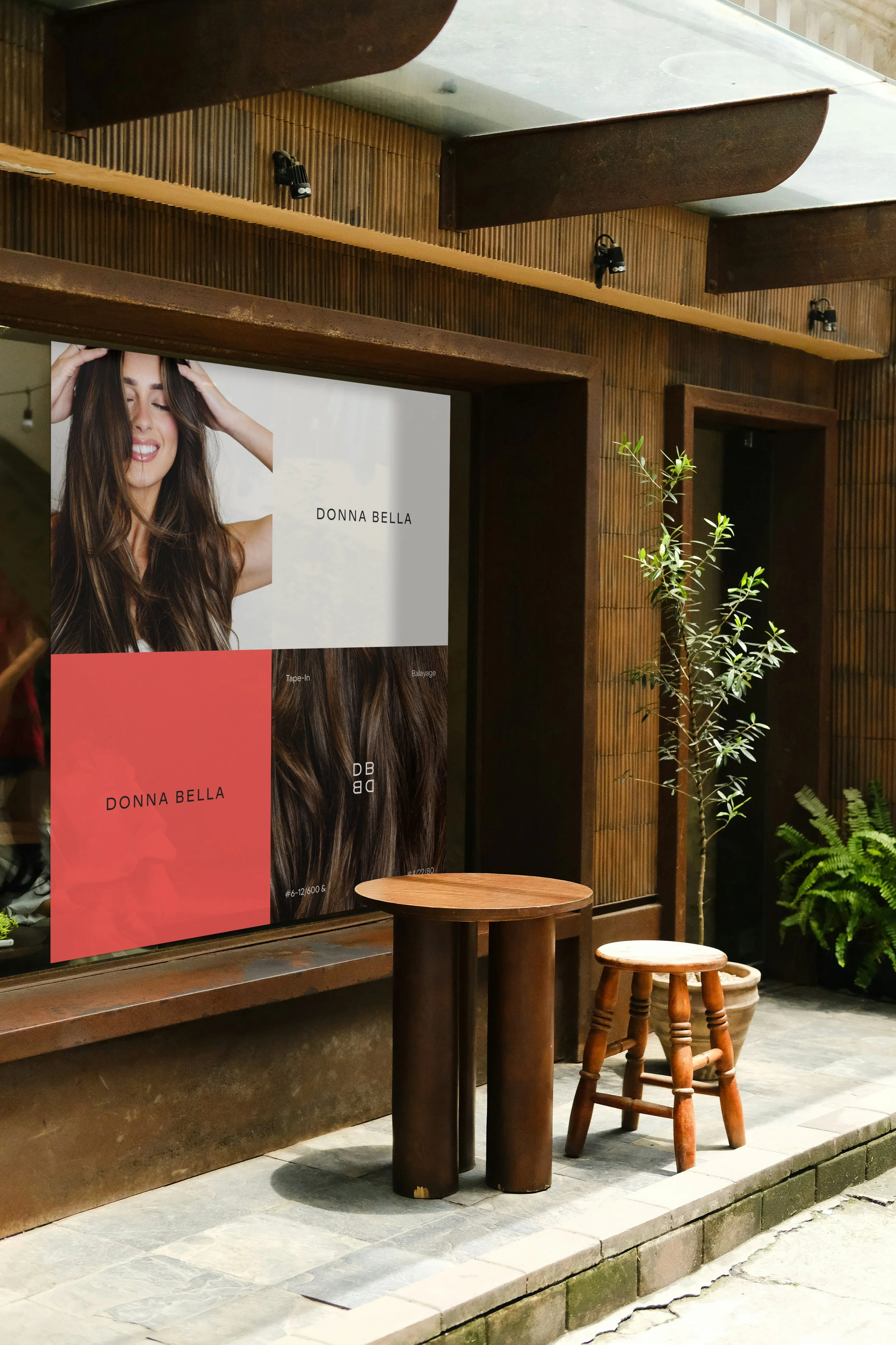
PAID ADVERTISEMENTS
Category:
Editorial Print Design
Deliverable:
5 Volume Series of magazine covers representative of holistic brand identity
-
The primary audience of Donna Bella is women ages 25+ that want to achieve salon-worthy hair with ease. Donna Bella targets both stylists and consumers, leaning into the professional edge and empowering them to make confident, value-driven choices. The brand speaks to savvy consumers that care about sustainability, sourcing, inclusivity, access to high-quality products and effortless style. For professional stylists, we offer trusted, high-quality products and education that elevate their expertise, increase revenue, and inspire client loyalty. For consumers, we provide approachable ways to embrace confidence and achieve professional-worthy results every day.
-
Donna Bella has been a trusted name in the professional hair industry for over 20 years, providing high quality hair products, accessories and education to help stylists create transformative looks for their clients. The brand is an industry leader- providing sustainable, ethically sourced, 100% Remy human hair extensions to thousands of stylists and consumers across North America. Several years ago the brand began to sell products directly to consumers (in addition to salons and stylists), and since has experienced growth that has emphasized the desperate need for a reimagined brand identity. With the of conservative projection of continued growth and anticipation of being sold in big box beauty retail storefronts in 2026, the need for an updated brand identity that conveyed an elevated, bold, innovative aesthetic was abhorrently apparent.
-
Creative direct the implementation of the rebrand and design the assets for the new brand identity in a cohesive, editorial, bold, transformative manor that allows for increased brand awareness, expansion and _____. Synthesize the goals of the brand, marketing, ecommerce, copywriting, and production teams at Beauty industry group via visual solutions that exemplify the new brand identity / establish the new aesthetic by prioritizing design while simultaneously accomplishing their individual team initiatives. Creative direct and design how the brand guide is brought to life, evoking a elevated, innovative, memorable consumer sentiment that is communicated at a glance and will stand out in a competitive storefront such as Sephora or Ulta. Curate a striking new take on the industry that reflects the editorial sensibility and elegance of the rebrand with the accessibility, playfulness and high quality of the product.


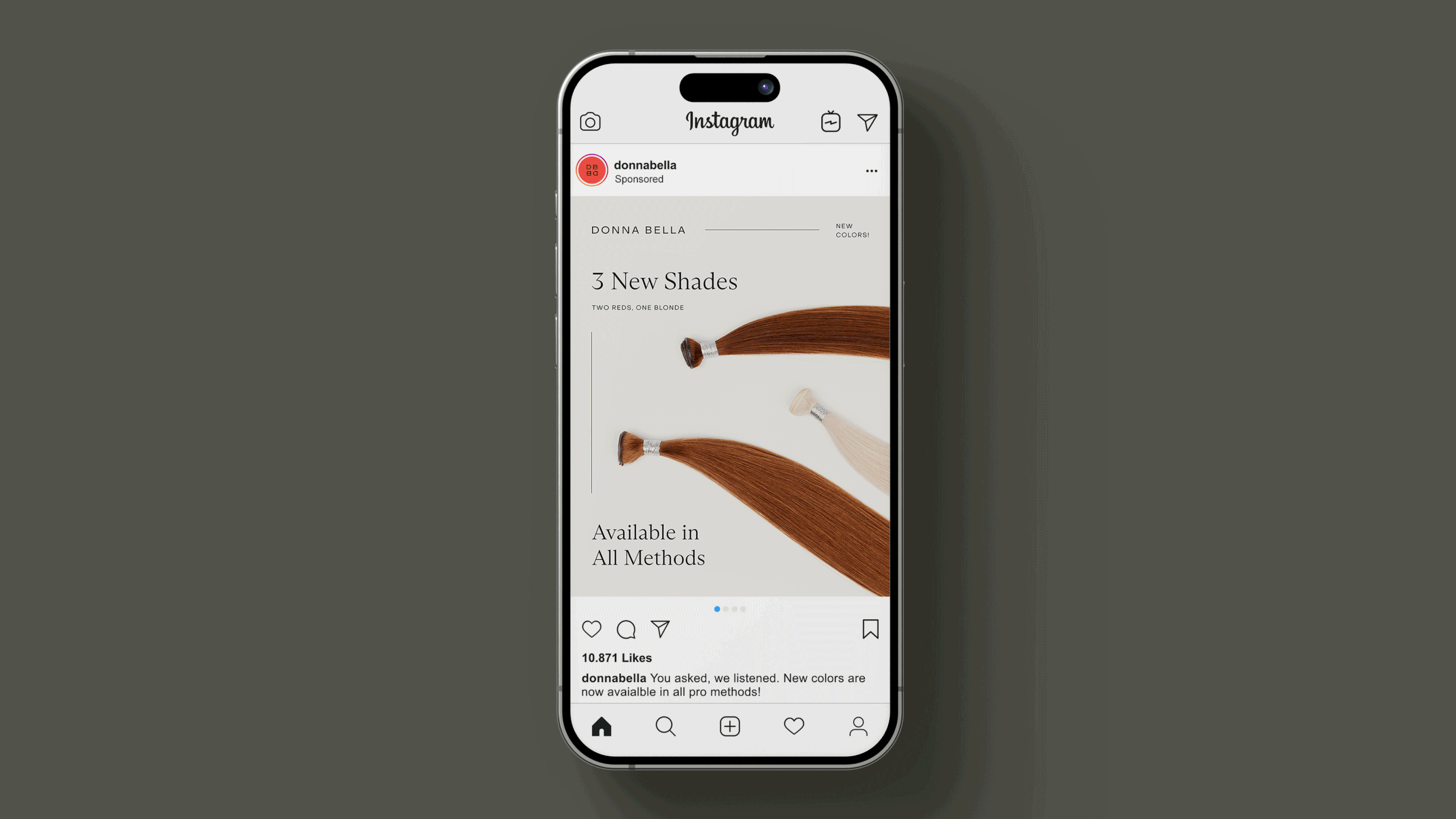
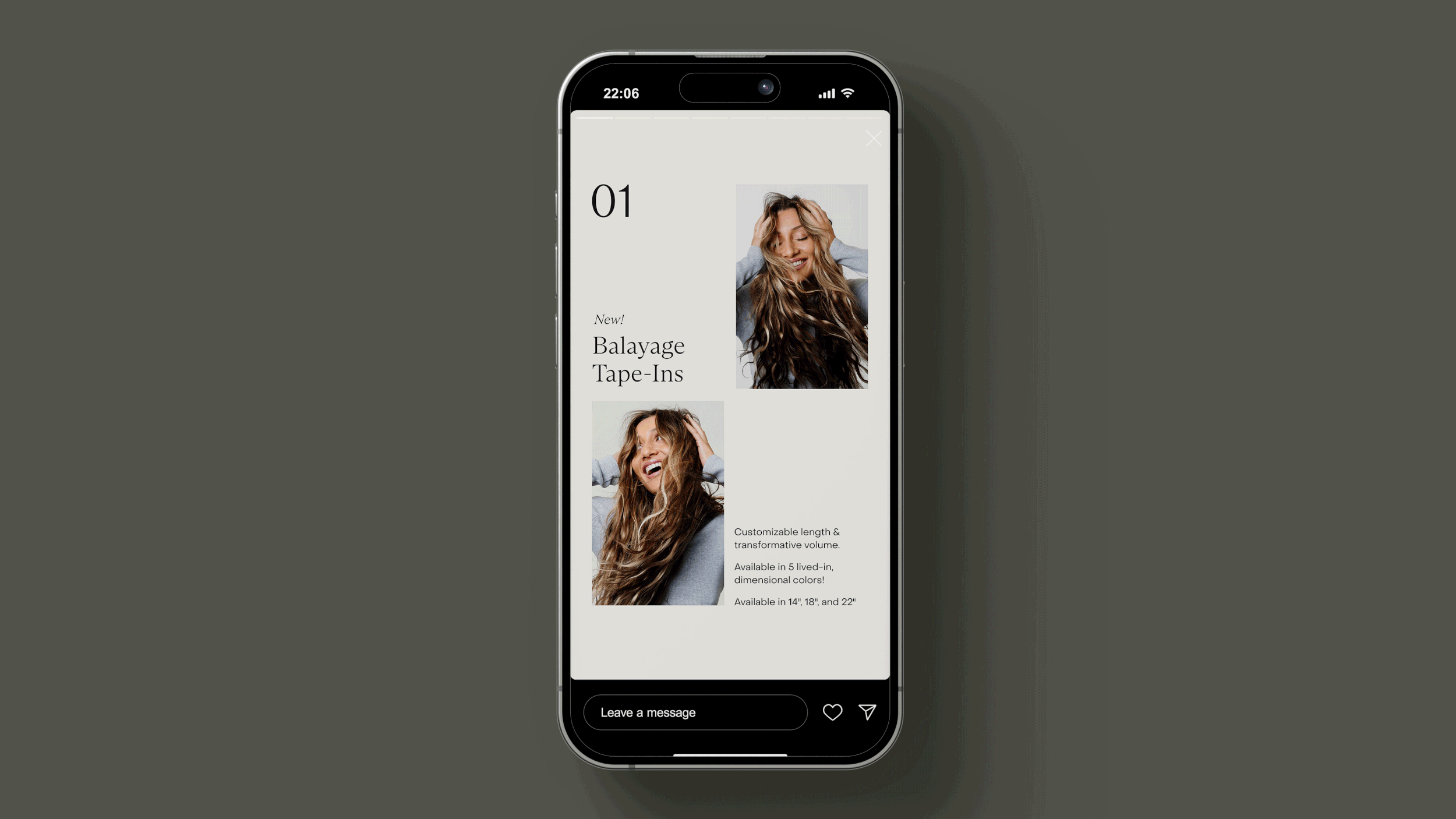
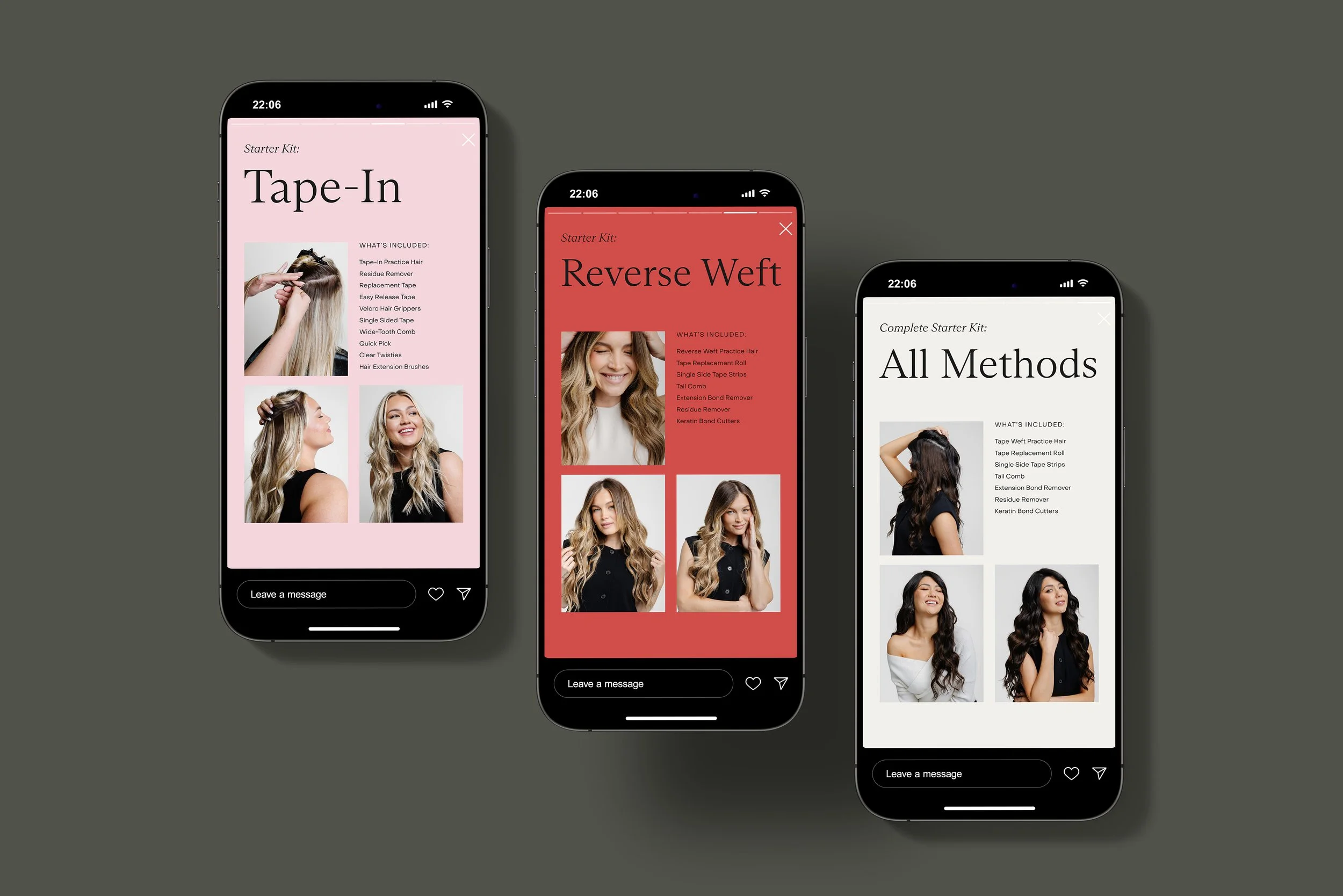
ORGANIC SOCIAL
Category:
Editorial Print Design
Deliverable:
Inside Spread magazine pages - volume 3
-
I personally am a fan of film photography and a common subject of film photography is vintage cars. While these images are striking, unique, sophisticated and elevated, I have never seen a film or vintage - inspired photo utilized in a modern car advertisement or publication. I decided to create a publication that stood out in the oversaturated market by placing the central focus on the utilization of primarily 35mm film imagery and vintage cars, rather than new ones. typography and simplistic layout in order to expand on the sentiments captured in the images used.
-
In order to create a series of magazine covers that were cohesive, striking, unique, elevated, chic and exclusive, I placed the central emphasis on the imagery that is included. These images create a unique feeling for the viewer as a result of the color composition, lighting, negative space and backgrounds that are commonly featured. Facilitating a unique feeling in the consumer is precisely what car advertisements and companies strive to do- and film photography is a new creative route to do so and to inspire a resurgence of vintage cars that provoke similar sentiments to this type of photography. In order to advance these notions, I accompanied the imagery with complementary vintage-inspired typography and color palette. I also used film photography in the advertisements that are included in the publication in order to keep the vibe consistent and to produce unique ads that stand out in the market.


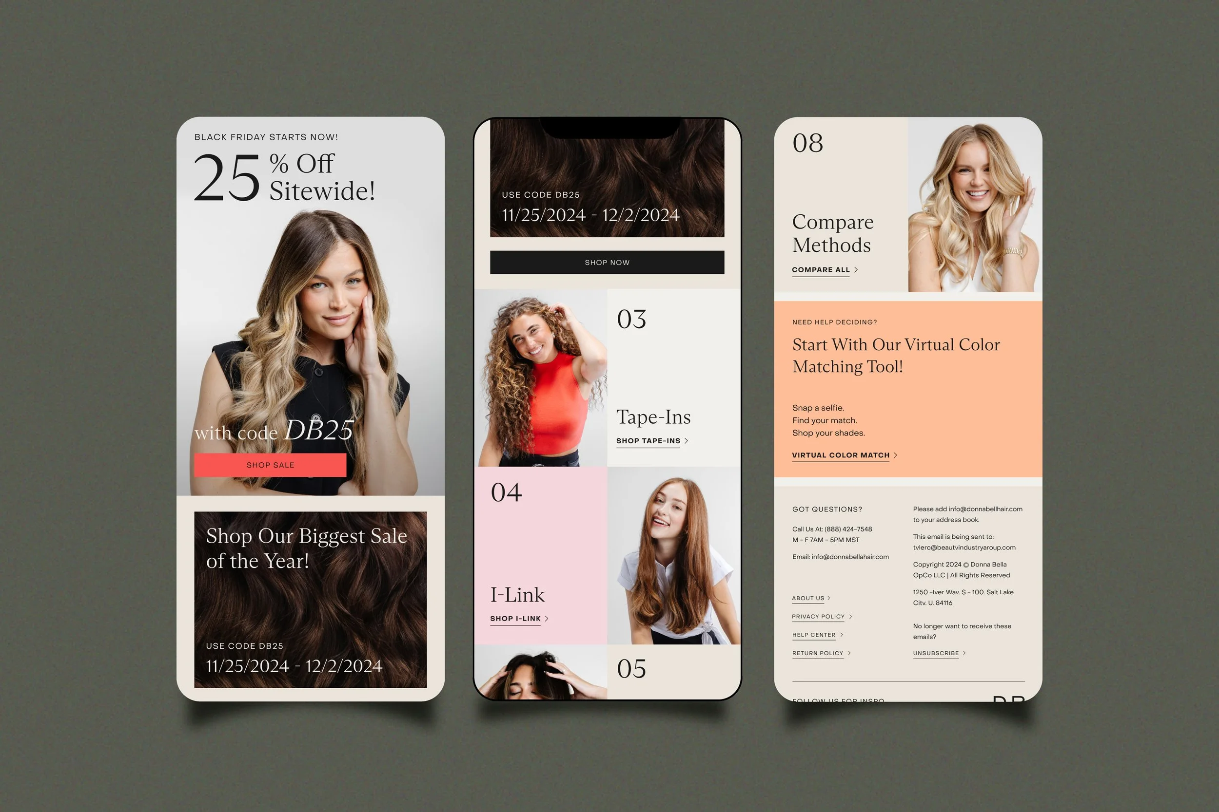
EMAIL DESIGN
Category:
Editorial Print Design
Deliverable:
Flat files - front cover, back cover & spine, 5 volumes of speed magazine
-
Covers:
Kepler Std- Black Italic, Medium Italic, and Medium DisplayInside spreads:
Header- Lust Fine
Subhead + Photo credits- Kepler Std Medium Display
Body Text- Minion Pro Regular -
Article written by Richard Perez-Pena, published in New York Times- originally titled “This Quirky Car Is Japanese- But There’s ‘Something Very British’ About It” - Jan 11, 2019
Spread photos: Toprank Vehicle Imports
-
Adobe Illustrator | Adobe Photoshop | Adobe InDesign


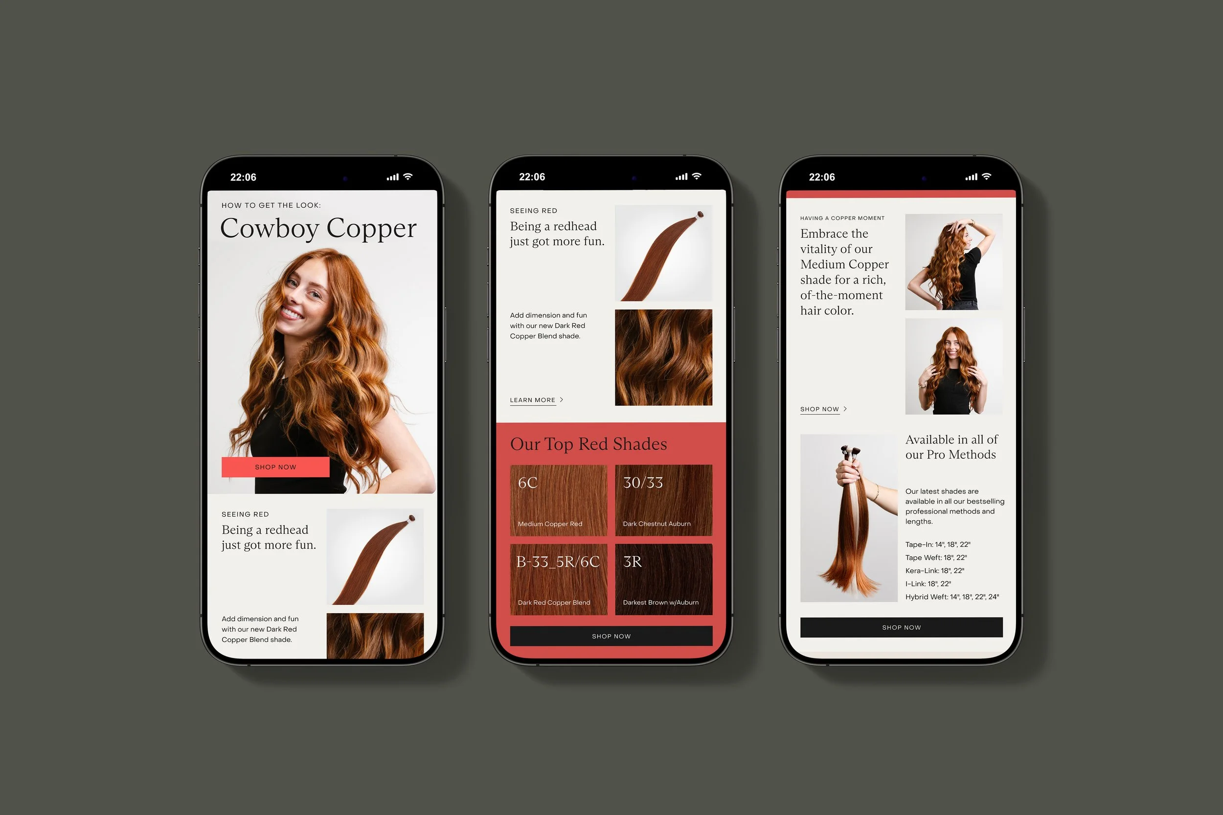

PRINT DESIGN
Category:
Editorial Print Design
Deliverable:
Flat files - front cover, back cover & spine, 5 volumes of speed magazine
-
Covers:
Kepler Std- Black Italic, Medium Italic, and Medium DisplayInside spreads:
Header- Lust Fine
Subhead + Photo credits- Kepler Std Medium Display
Body Text- Minion Pro Regular -
Article written by Richard Perez-Pena, published in New York Times- originally titled “This Quirky Car Is Japanese- But There’s ‘Something Very British’ About It” - Jan 11, 2019
Spread photos: Toprank Vehicle Imports
-
Adobe Illustrator | Adobe Photoshop | Adobe InDesign

< PREVIOUS