LUXY HOLIDAY CAMPAIGN
Luxy is the #1-rated ready-to-wear hair extensions brand worldwide, redefining hair extensions since 2010. This premium hair extension & accessories brand prioritizes sustainability and inclusivity through ethical sourcing and exists with the mission of empowering everyone to cultivate a sense of confidence, abundance, and play. This project showcases two of Luxy’s holiday campaigns, both created with the goals of promoting a large sale and standing out among competition during the most highly saturated times of the year. The creative direction for each of these campaigns introduced a new color into the standard brand color palette- a cobalt blue and bright yellow respectively. This creative decision was made with the goals of differentiating from evergreen assets, making a bold an editorial design statement, and increasing brand awareness. These two colors are utilized in a similar way across assets, serving as a bold design accent that both highlights the sale and catches the customers eye- both new and returning.
LUXY HOLIDAY SALE CAMPAIGN DESIGN
Creative Brief
Create campaign assets to promote Luxy’s holiday sales, incorporating the respective creative direction into each design across all channels (ecommerce, paid advertisements, organic social, email, etc.). Both campaigns should incorporate the new color that was introduced into the traditional brand color palette to emphasize the sale and make a bold, editorial design statement. These accent colors should be utilized to make this campaign stand out from evergreen assets, promote the sale, and to facilitate memorable impressions on both new returning customers. In order to make a high fashion, editorial design statement with this campaign, incorporate unique layouts, playful typography, and bold compositions into each asset while intertwining the standard color palette and evergreen layouts in order to ensure that everything feels quintessentially luxy.
Client
Luxy Hair
Timeline
Q4 2024
Project
17
Company
Beauty Industry Group (B.I.G. LLC)
17
2024
PAID ADVERTISEMENTS
Category:
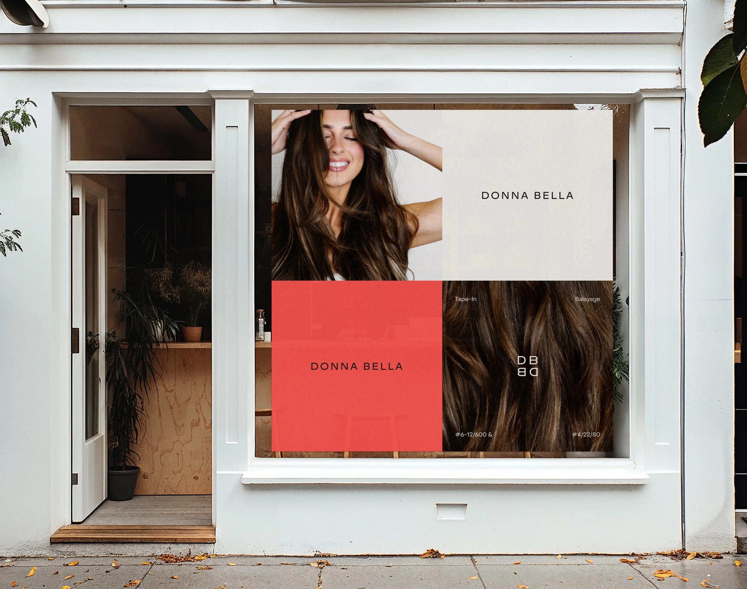
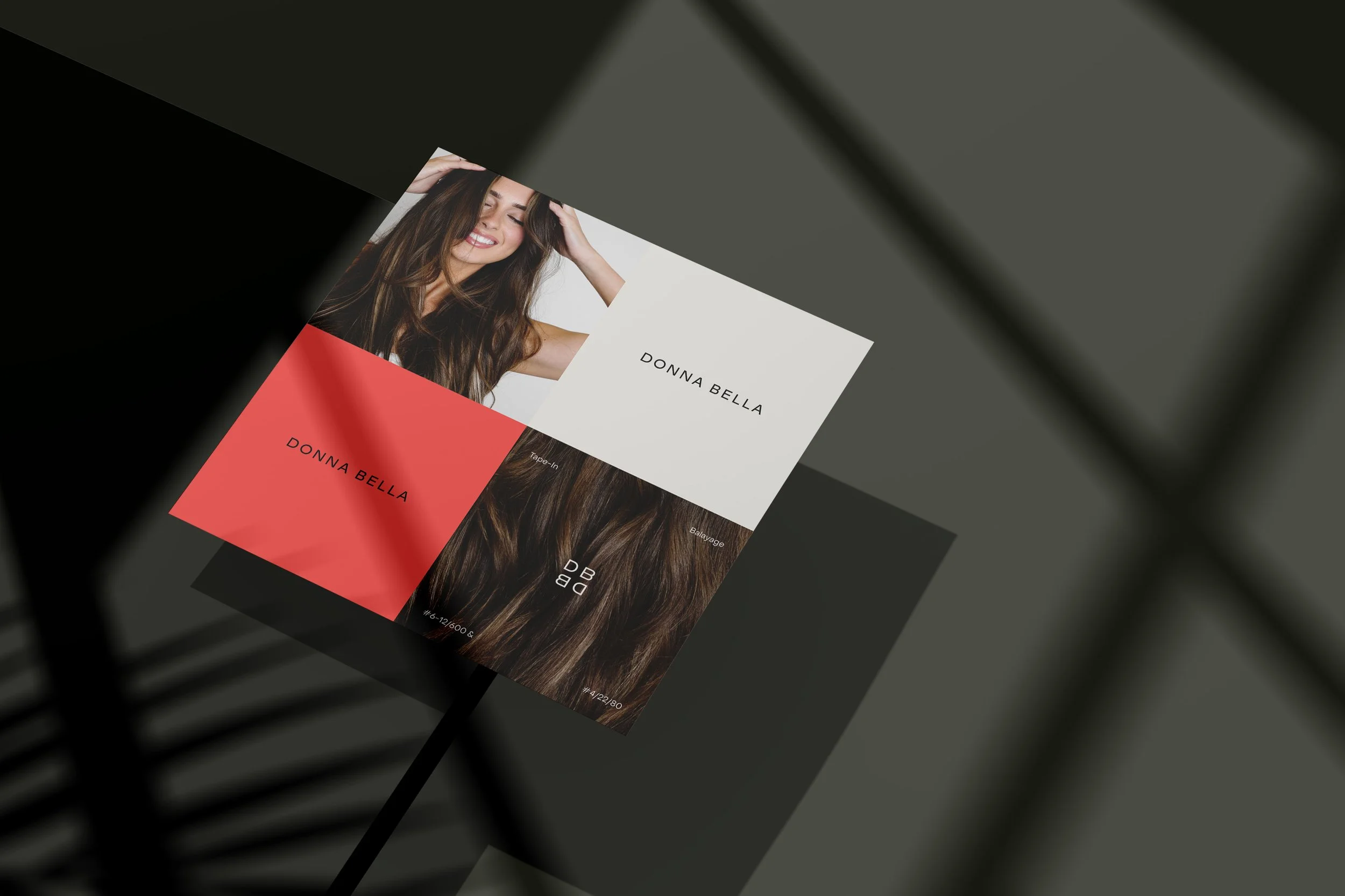
Creative Direct & Design the execution of the new Donna Bella brand identity across all channels.
Deliverable:
Define Donna Bella’s new visual language through the translation of the brand guide across digital paid advertisements.
-
Luxy divides their target audience up into two separate groups- the first being the primary core demographic (millennials ages 25-45), and the second being new customers who are seeking a solution for thinning hair (millennials over 35 and Gen-X). While both campaigns target our full audience, the first of the two (Black Friday campaign with cobalt blue), specifically hones in on our core customers. This demographic is very aware of trends, receptive to bold and elevated design, and needs striking visual stimulation to peak interest. The second of the two campaigns (Holiday campaign with bright yellow), is aiming to target the solutions customer by tapping into their appreciation for nostalgic, elevated and lifestyle-centered design.
-
Luxy’s audience responds really well to elevated, bold, editorial design decisions and the introduction of new design concepts for campaign-specific promotions. These campaigns are promoting Luxy’s biggest sales of the year. Due to the market saturation during this time of year (around black Friday / cyber Monday), it was essential that these campaigns stand out among competition by making a bold statement that garners consumer attention, while still being recognizably luxy.
-
The overall objective of both campaigns was to promote their respective sales while making a bold editorial design statement that felt both new and striking while still being recognizably Luxy. In order to bring the creative direction for each of these campaigns to life, we focused on incorporating new imagery from two photoshoots that were curated with the goal of aiding the desired editorial and nostalgic sentiments. The first of the two photoshoots is consists of playful, high-fashion, editorial studio imagery that we primarily used to support the cobalt blue design direction. We aimed to engage our core demographic with this concept, utilizing playful layouts, striking color application, playful typography and bold imagery to garner media attention during the most oversaturated time of the year. The second of the two photoshoots was product-focused, showcasing the holiday bundles floating around the Luxy signature sky background. This was paired with the bright yellow accent color in order to curate a dreamy, nostalgic sentiment to the customer that appeals specifically to our solutions customer.
-
After the creative direction was in place, the photoshoots were completed and the brand objectives were identified, we began with typography / layout mockups that captured the essence of the creative direction while utilizing Luxy’s brand assets and real copy. Unique, striking, effective, playful and innovative typography was an essential element of both of these campaigns, central to bringing the desired creative direction to life. To curate an editorial sentiment and stand out from evergreen content, Luxy uses a combination of Saol uppercase and lowercase italics for campaign specific assets. This tactic is exemplified throughout the holiday campaign that features a bright yellow accent, as the typography is central to the summertime nostalgic sentiment that is felt across this concept. This design approach is further explored in the black Friday campaign which introduces the cobalt blue accent color in order to curate a high-fashion, editorial sentiment. We focused on playful and bold typography, heavily leveraging our secondary font as the composition and layouts rely heavily on the usage of all caps, full bleed headlines in both our brand typefaces.


EMAIL DESIGN
Category:
Creative Direct & Design the execution of the new Donna Bella brand identity across all channels.
Deliverable:
Define Donna Bella’s new visual language through the translation of the brand guide across a series of organic social assets.
-
The goal of both of these campaigns was to catch the eye of the chic, fashionable, tastemaker customers during the most oversaturated time in media. In order to accomplish this, make the desired bold visual statement, embody the creative direction, and still be recognizably Luxy, it was essential that we incorporated familiar evergreen design elements into these assets. By utilizing the new accent colors and curated imagery to facilitate striking composition, we were able to make a striking sentiment without losing the essence of the Luxy brand identity. To further this recognizability and add consistency we implemented the usage of the sky backgrounds and product images across both campaigns and our evergreen / seasonal assets.
-
Adobe Illustrator | Adobe Photoshop | Adobe InDesign | Figma
-
Primary Typeface -
Saol Display
Regular | Italic
Sentence case
1.05X leading | -20 kerningSecondary Typeface -
Acumin pro regular | italic
Bold for emphasis
Bold & underlined for CTA
Sentence case
1.25X leading | 0 kerningAcumin pro bold
Upper case for headlines
Eyebrow- 1.5X leading | 400 kerning
Subhead- 1.5X leading | 100 kerning


WEBSITE UPDATES
Category:
Creative Direct & Design the execution of the new Donna Bella brand identity across all channels.
Deliverable:
Define Donna Bella’s new visual language through the translation of the brand guide across 340+ individual emails (flow & campaign).
-
Design team at Beauty Industry Group (B.I.G. LLC), where I was able to both collaborate with other incredible designers on these projects and work under Elizabeth Huynh’s incredible creative direction. I’d also like to give credit to the Luxy brand marketing team at Beauty Industry Group (B.I.G. LLC), the in house copywrite team, production team, internal ecommerce, marketing & retention teams for aiding in the execution of the above assets.
-
Black -#000000
CMYK 75 / 68 / 67 / 90
RBG 0 / 0 / 0Cream – #F5F3EF
CMYK 3 / 2 / 4 / 0
RBG 245 / 243 / 239Blue – #A5C0D3
CMYK 35 / 16 / 10 / 0
RBG 165 / 192 / 211White – #FFFFFF
CMYK 0 / 0 / 0 / 0
RBG 255 / 255 / 255Taupe – #B9B3AA
CMYK 29 / 25 / 31 / 0
RBG 185 / 179 / 170Beige – #E1DBC9
CMYK 11 / 10 / 20 / 0
RBG 225 / 219 / 201 -
Light Beige – #E6E5DE
CMYK 9 / 7 / 11 / 0
RBG 230 / 229 / 222Light Gray – #CACDCC
CMYK 20 / 14 / 16 / 0
RBG 202 / 205 / 204Light Blue – #D3D9DB
CMYK 16 / 9 / 10 / 0
RBG 211 / 217 / 219Dark Gray – #686868
CMYK 59 / 51 / 50 / 19
RBG 104 / 104 / 104Navy – #1A2B41
CMYK 91 / 78 / 48 / 50
RBG 26 / 43 / 65Cobalt Blue* – #0F2A81
CMYK 100 / 93 / 18 / 7
RGB 15 / 42 / 129Bright Yellow* – #FDFB07
CMYK 6 / 0 / 94 / 0
RGB 253 / 251 / 7*Accent color, used for this campaign only


< PREVIOUS