LUXY MARKETING CAMPAIGN DESIGN
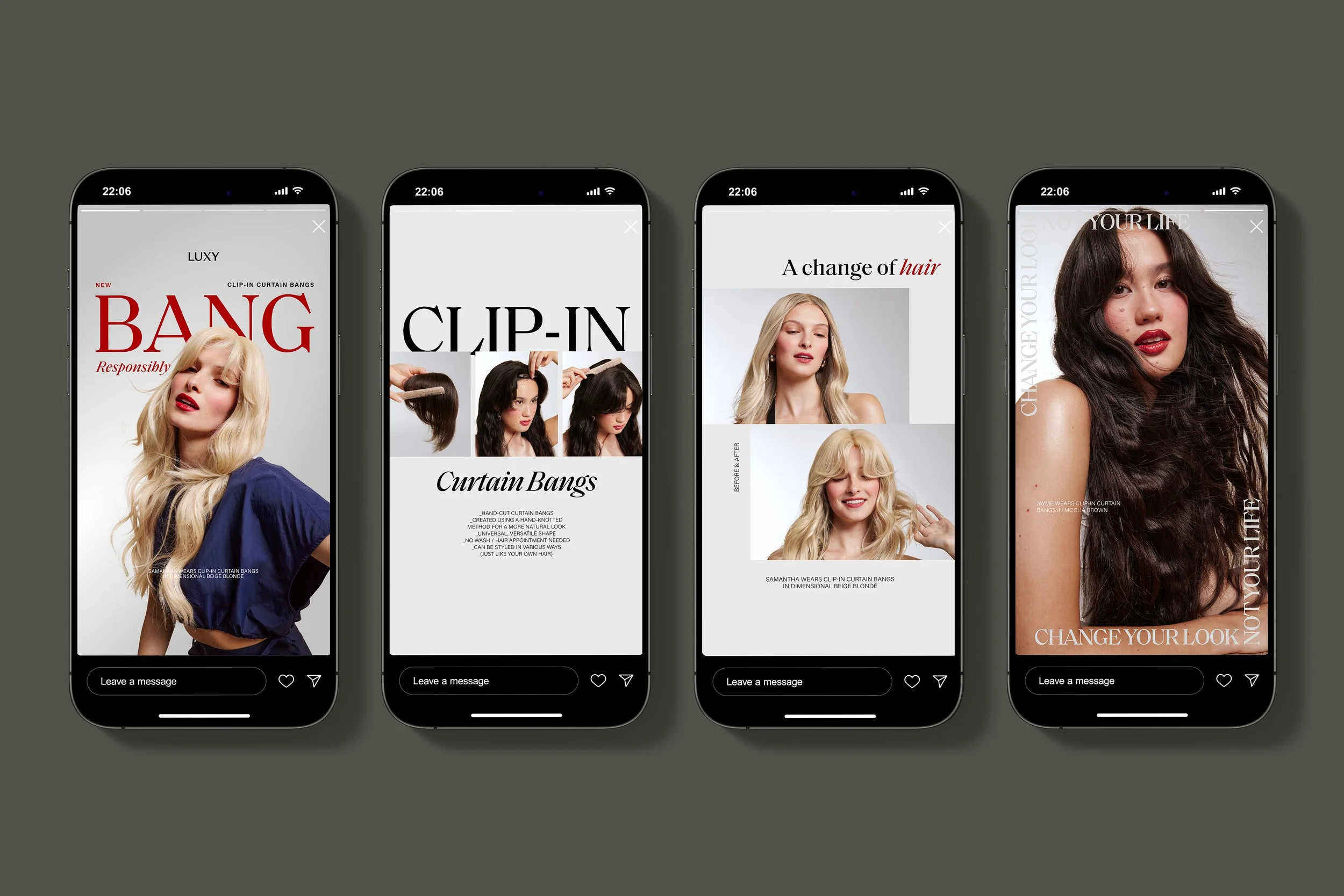
Luxy is the #1-rated ready-to-wear hair extensions brand worldwide, redefining hair extensions since 2010. This premium hair extension & accessories brand prioritizes sustainability and inclusivity through ethical sourcing and exists with the mission of empowering everyone to cultivate a sense of confidence, abundance, and play. This project showcases a marketing campaign created for the launch of Luxy’s clip-in curtain bangs. The creative objective of this campaign was to introduce the new method to the customer via cheeky messaging intertwined with elevated, bold, editorial design. This playful angle not only appeals to our target consumer, but allows the brand to carve a space in the oversaturated beauty market by furthering the brand’s identity through visual storytelling, increasing brand impressions. The creative direction for this campaign introduced a new color into the standard brand color palette – a deep red. This decision was made with the goals of standing out from evergreen content, remaining seasonally relevant, increasing brand awareness, highlighting the cheeky messaging via typography, and making a bold an editorial design statement.
LUXY NEW PRODUCT LAUNCH CAMPAIGN
Creative Brief
Design campaign assets for the launch of a new hair extension method from Luxy, the Clip-In Curtain Bangs. This assets should translate the creative direction and the brand identity across all channels (ecommerce, paid advertisements, organic social, email, etc.), furthering the brand’s visual story and consumer impressions. Incorporate the dark red accent color (added to the brand palette for this campaign only), as a consistent design accent utilized to stand out from evergreen assets, emphasize the cheeky nature of the messaging through bold editorial typography, and to facilitate memorable impressions on both new returning customers. In order to make a high fashion, editorial design statement with this campaign, incorporate unique layouts, playful typography, and bold compositions into each asset while intertwining the standard color palette and evergreen layouts in order to ensure that everything remains recognizably Luxy.
Client
Luxy Hair
Timeline
End of Q3-Q4 2024
Project
18
Company
Beauty Industry Group (B.I.G. LLC)
18
2025
PAID ADVERTISEMENTS
Category:
Creative Direct & Design the execution of the new Donna Bella brand identity across all channels.
Deliverable:
Define Donna Bella’s new visual language through the translation of the brand guide across digital paid advertisements.
-
Luxy divides their target audience up into two separate groups- the first being the primary core demographic (millennials ages 25-45), and the second being new customers who are seeking a solution for thinning hair (millennials over 35 and Gen-X). This campaign appeals to both our target audiences, prioritizing the core demographic for this product. This demographic is aware of trends, appreciative of cheeky messaging, receptive to bold editorial design, and needs striking visual stimulation to peak interest. This campaign appeals to our solutions customer by focusing on elevated, lifestyle-centered design that highlights the quality of the product while enhancing the brand story.
-
The goal of this campaign was to inspire the customer to embrace the playful, versatile nature of the products by emphasizing the ethical, attainable nature of everyday beauty through bold, editorial design. Knowing that our customers are willing to pay more for sustainable brands that embody elevated design and reflect their vibrant personality and lifestyle, it was essential to exemplify the elevated, vibrant, playful nature of this campaign. Create a visual solution that showcases how Luxy intertwines confidence, inclusivity and wit through design composition, imagery and typography to empower everyone to cultivate a sense of abundance and play.
-
The decision to focus on cheeky messaging and bold typography across assets allowed the campaign to stay trend relevant while speaking to our younger audience. Targeting our solutions demographic and new customers, this campaign features unique, striking, retro-inspired hero images paired with bold editorial compositions that highlight the modern messaging while also curating nostalgic sentiment. The photoshoot’s retro-inspired styling paired with the red accent color allowed for a complimentary contrast between this nostalgic sentiment and the cheeky, playful concept of the overall campaign.


EMAIL DESIGN
Category:
Creative Direct & Design the execution of the new Donna Bella brand identity across all channels.
Deliverable:
Define Donna Bella’s new visual language through the translation of the brand guide across a series of organic social assets.
-
The playful approach of pairing striking imagery with modern messaging conveyed through editorial typography not only appealed to our target consumer, but allowed for Luxy to carve a space in the oversaturated beauty market by leveraging bold design. The contrast between the photoshoot’s retro-inspired styling and simultaneous cheeky messaging was emphasized by the consistent red design accent, which allowed for a playful yet elevated campaign that stood out across media. In order to allow the assets to be imaginative and bold while remaining elevated, unique and editorial, layouts with full bleed headlines, thumbnail imagery, and bold typography were incorporated throughout the campaign. We heavily played with scale across these assets, leaning into negative space and paring strong full-bleed imagery with smaller thumbnails for greater visual impact.
-
Adobe Illustrator | Adobe Photoshop | Adobe InDesign | Figma
-
Primary Typeface -
Saol Display
Regular | Italic
Sentence case
1.05X leading | -20 kerningSecondary Typeface -
Acumin pro regular | italic
Bold for emphasis
Bold & underlined for CTA
Sentence case
1.25X leading | 0 kerningAcumin pro bold
Upper case for headlines
Eyebrow- 1.5X leading | 400 kerning
Subhead- 1.5X leading | 100 kerning


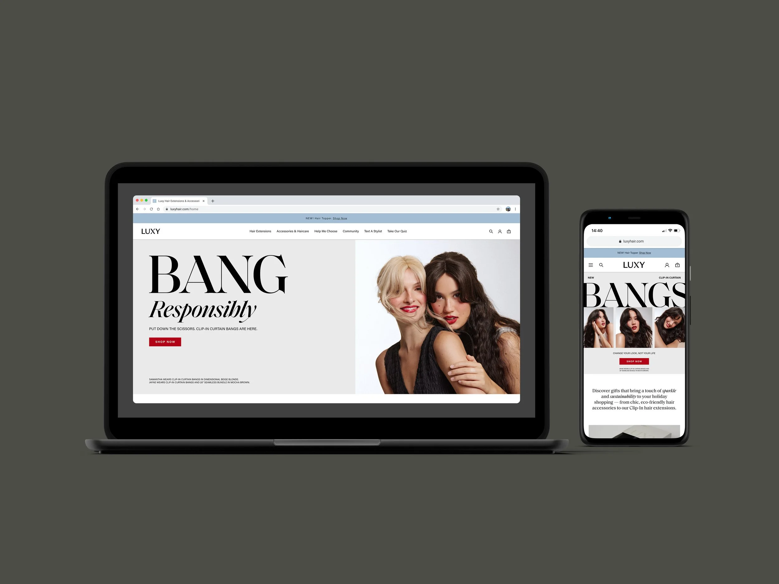
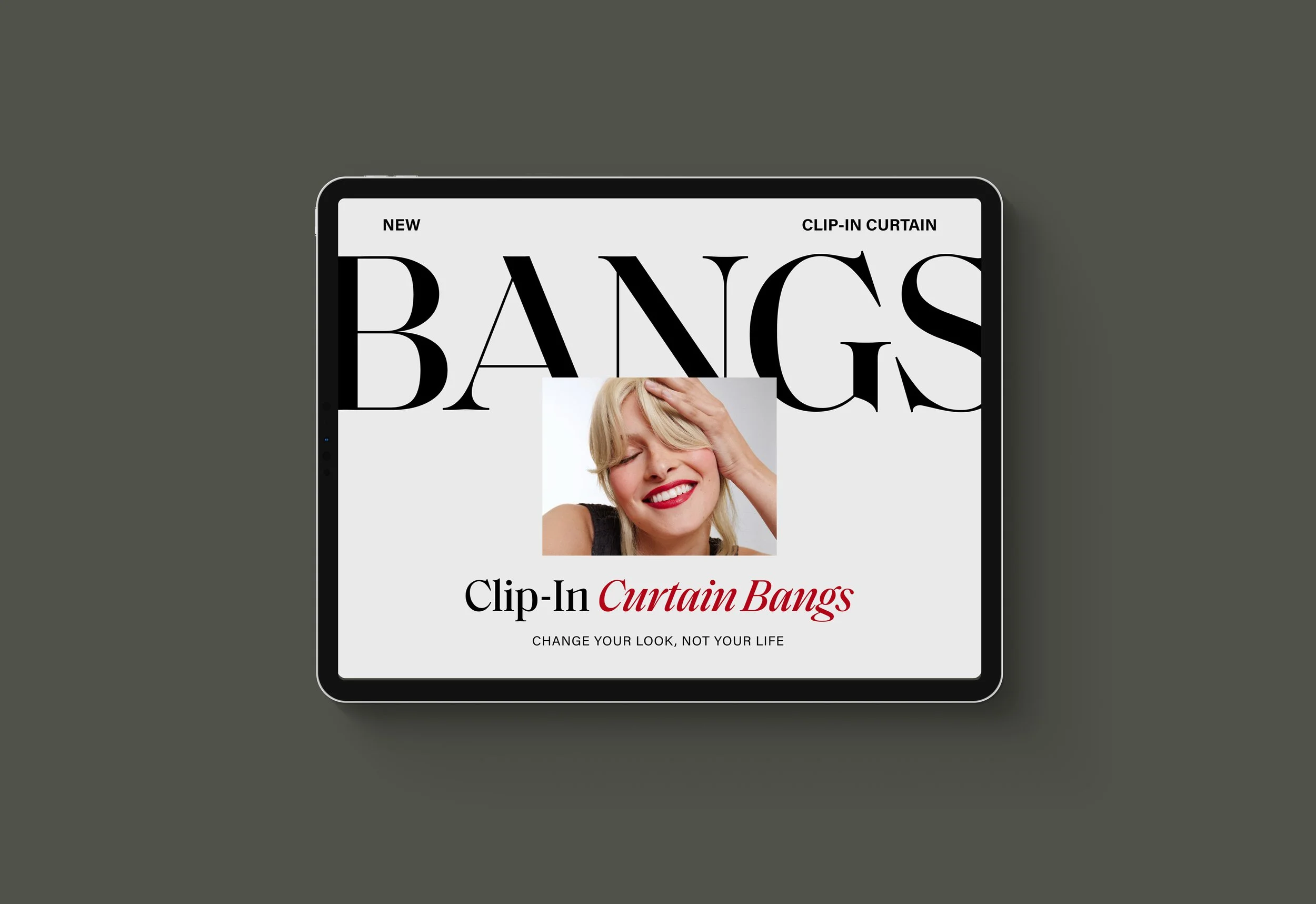
WEBSITE UPDATES
Category:
Creative Direct & Design the execution of the new Donna Bella brand identity across all channels.
Deliverable:
Define Donna Bella’s new visual language through the translation of the brand guide across 340+ individual emails (flow & campaign).
-
Design team at Beauty Industry Group (B.I.G. LLC), where I was able to both collaborate with other incredible designers on these projects and work under Elizabeth Huynh’s incredible creative direction. I’d also like to give credit to the Luxy brand marketing team at Beauty Industry Group (B.I.G. LLC), the in house copywrite team, production team, internal ecommerce, marketing & retention teams for aiding in the execution of the above assets.
-
Black -#000000
CMYK 75 / 68 / 67 / 90
RBG 0 / 0 / 0Cream – #F5F3EF
CMYK 3 / 2 / 4 / 0
RBG 245 / 243 / 239Blue – #A5C0D3
CMYK 35 / 16 / 10 / 0
RBG 165 / 192 / 211White – #FFFFFF
CMYK 0 / 0 / 0 / 0
RBG 255 / 255 / 255Taupe – #B9B3AA
CMYK 29 / 25 / 31 / 0
RBG 185 / 179 / 170Beige – #E1DBC9
CMYK 11 / 10 / 20 / 0
RBG 225 / 219 / 201 -
Light Beige – #E6E5DE
CMYK 9 / 7 / 11 / 0
RBG 230 / 229 / 222Light Gray – #CACDCC
CMYK 20 / 14 / 16 / 0
RBG 202 / 205 / 204Light Blue – #D3D9DB
CMYK 16 / 9 / 10 / 0
RBG 211 / 217 / 219Dark Gray – #686868
CMYK 59 / 51 / 50 / 19
RBG 104 / 104 / 104Navy – #1A2B41
CMYK 91 / 78 / 48 / 50
RBG 26 / 43 / 65Dark Red* - #A90000
CMYK 22 / 100 / 100 / 17
RGB 169 / 0 / 0*Accent color, used for this campaign only

< PREVIOUS