
TYPOGRAPHY CLASSIFICATIONS
POSTER SERIES DESIGN
CREATIVE DIRECTION & DESIGN - POSTER SERIES
GRAD STUDENT – UNIVERSITY OF CALIFORNIA BERKELEY EXTENSION GRAPHIC DESIGN (FULL-TIME)
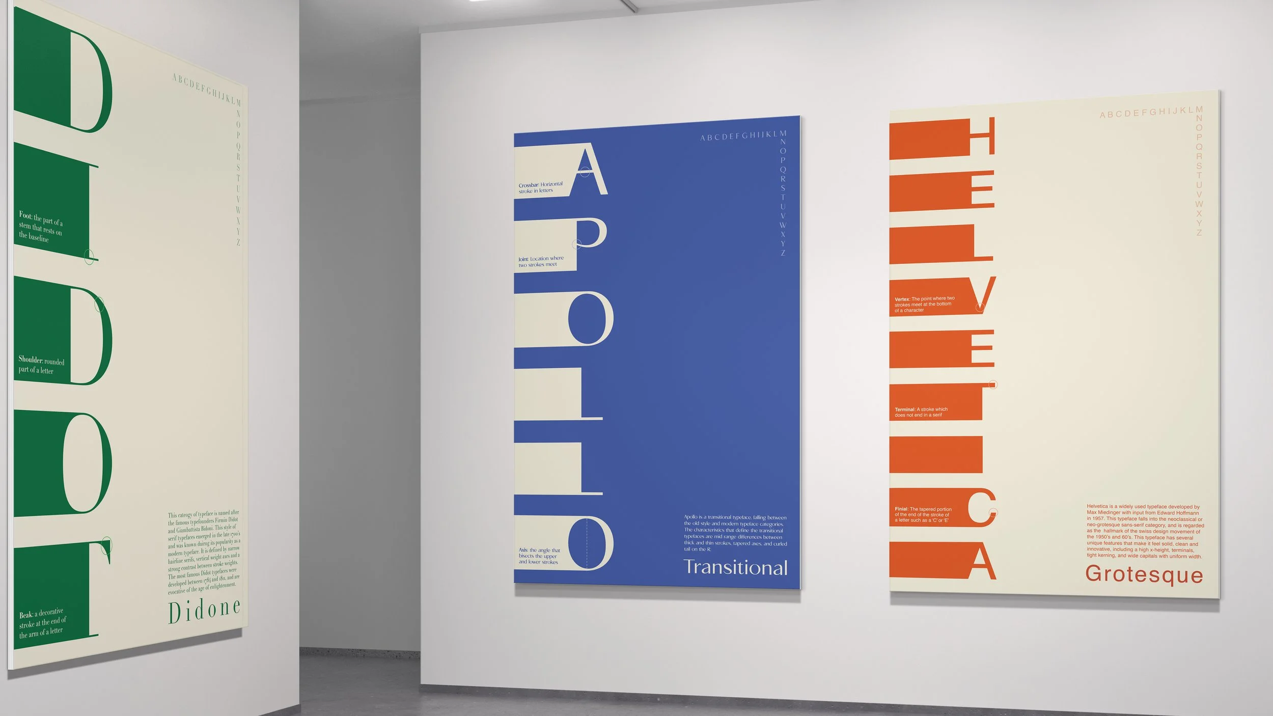
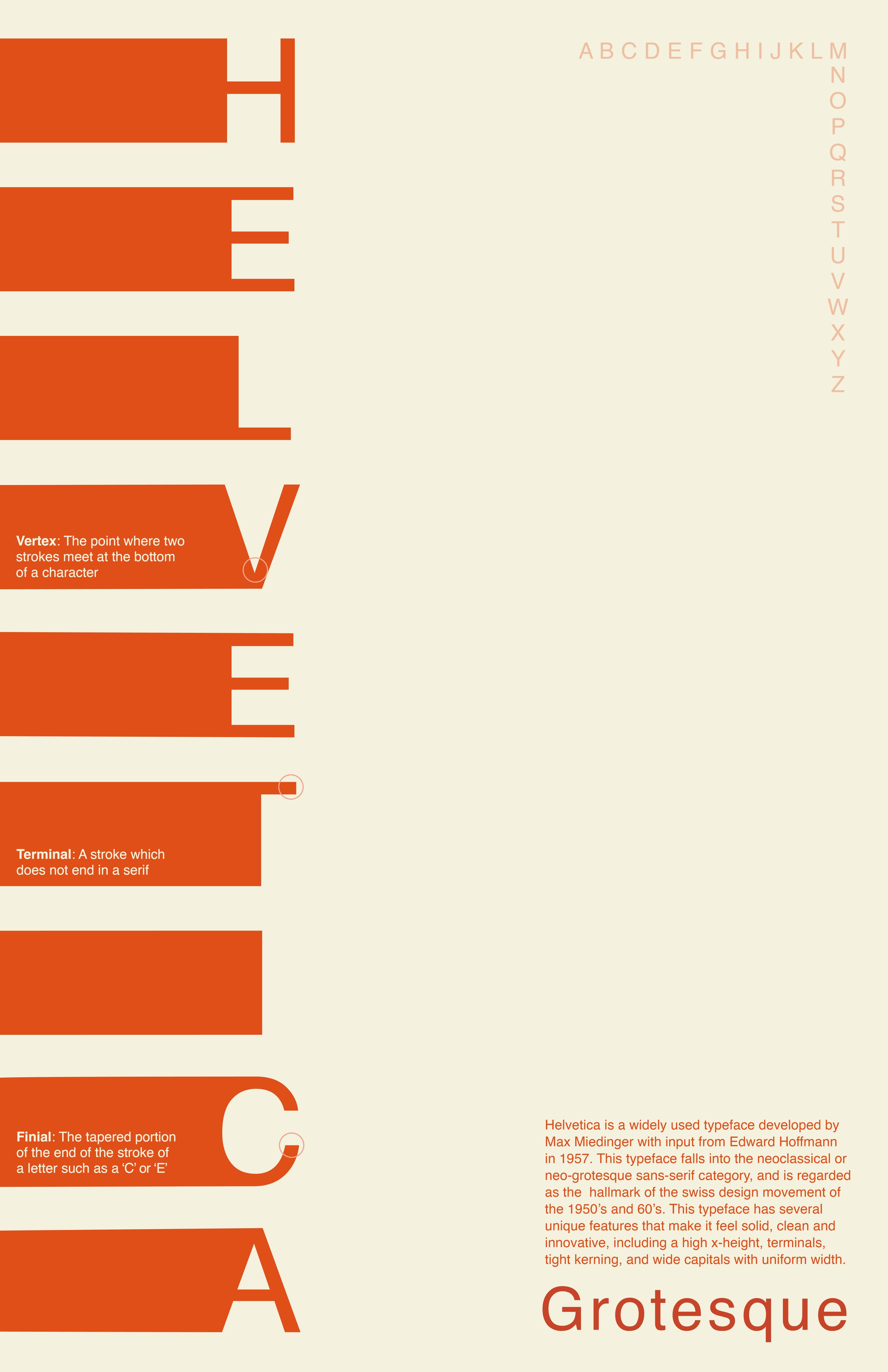
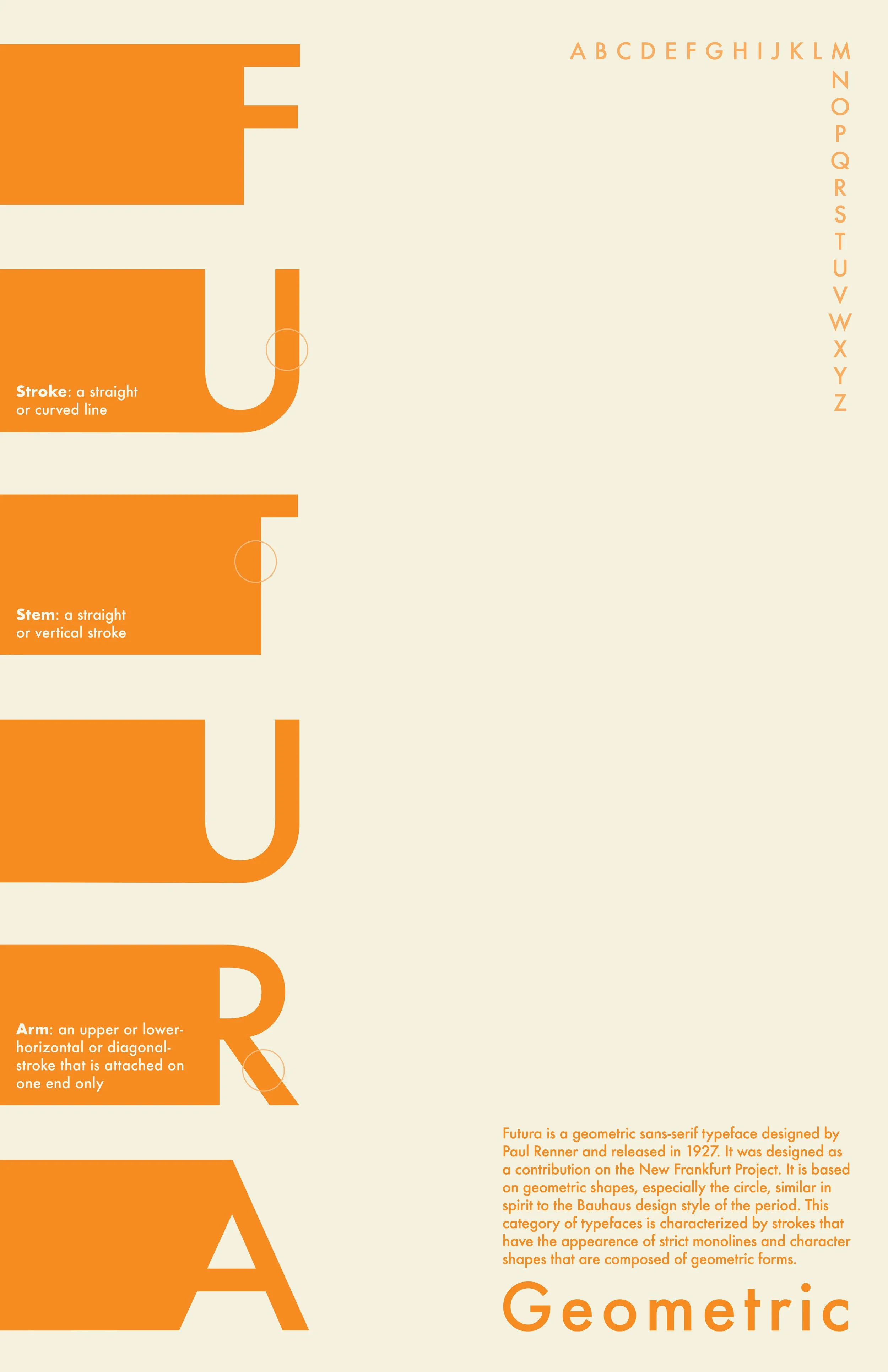
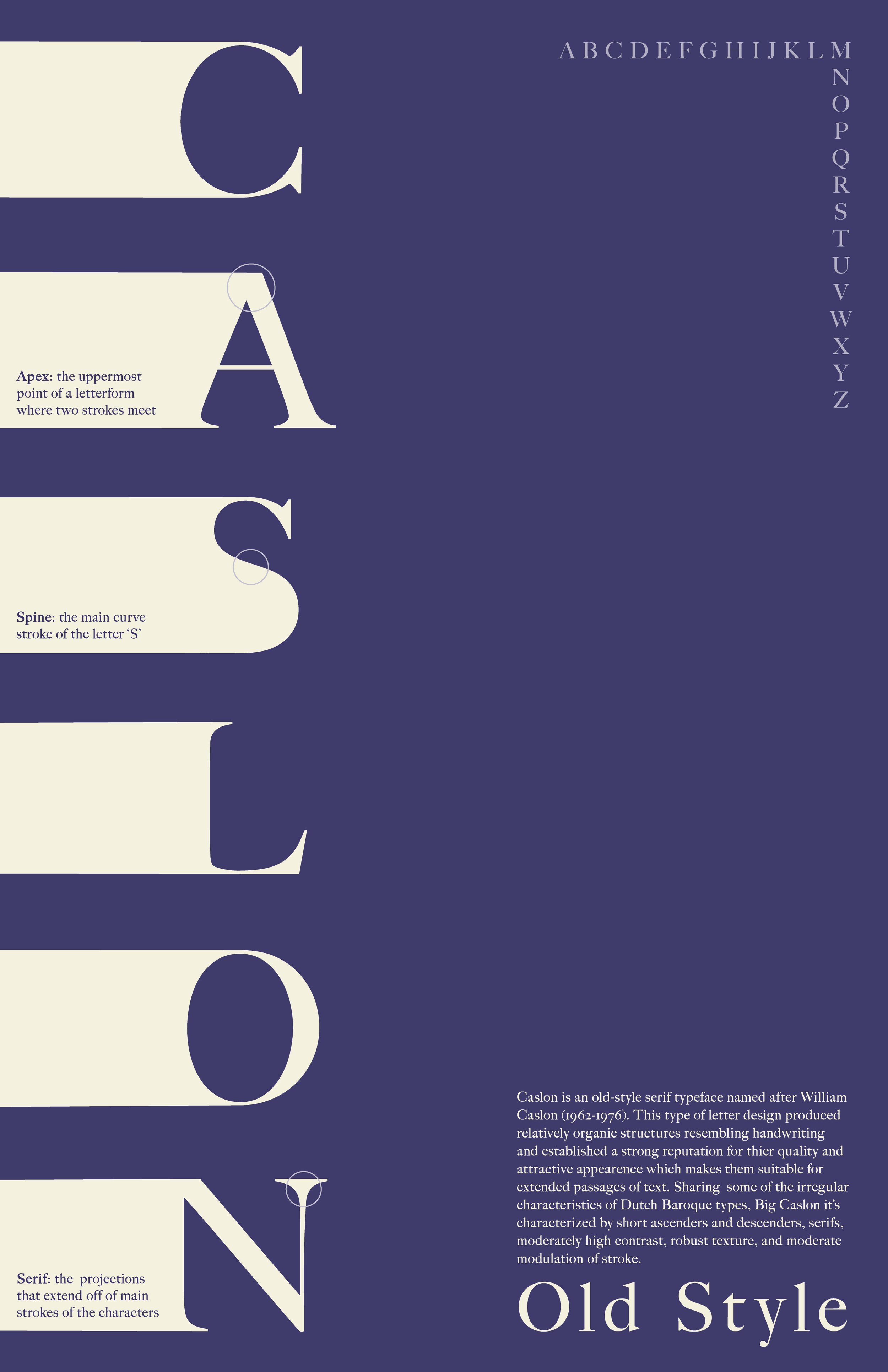
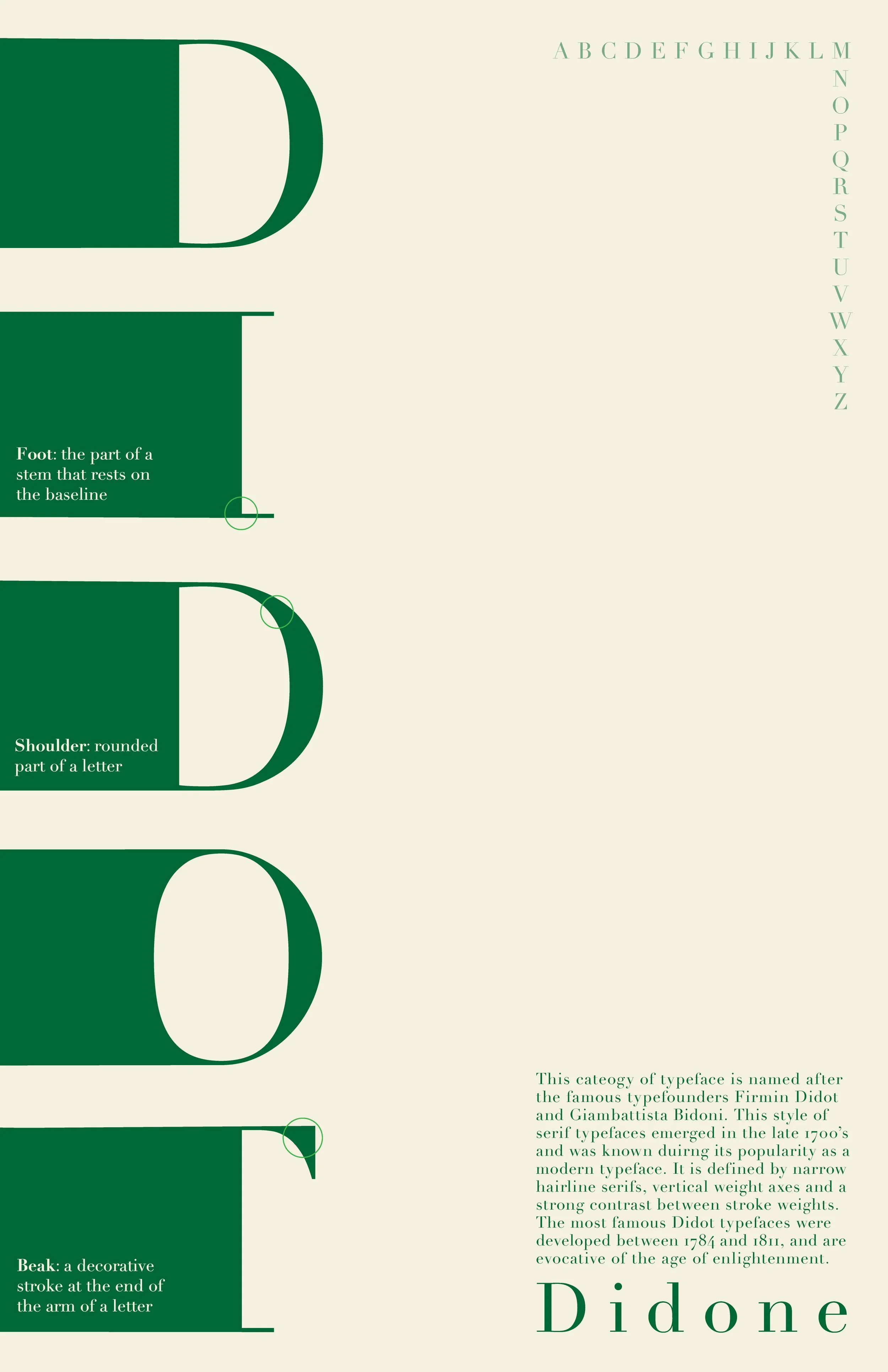
This Type classification poster series serves as an infographic that explores and defines the Vox System Typography Classifications through examples, reflecting the typographic landscape and providing background on the typeface and its classification. The bold, dynamic, structured layout of this series was inspired by traditional Swiss design. The typefaces were selected as prime representations of their respective categories while also exemplifying the complimentary nature of the combination between differing categories.


PROJECT DETAILS
CREATIVE DIRECTION & DESIGN- TYPOGRAPHY CLASSIFICATION POSTER SERIES
DEC 2021
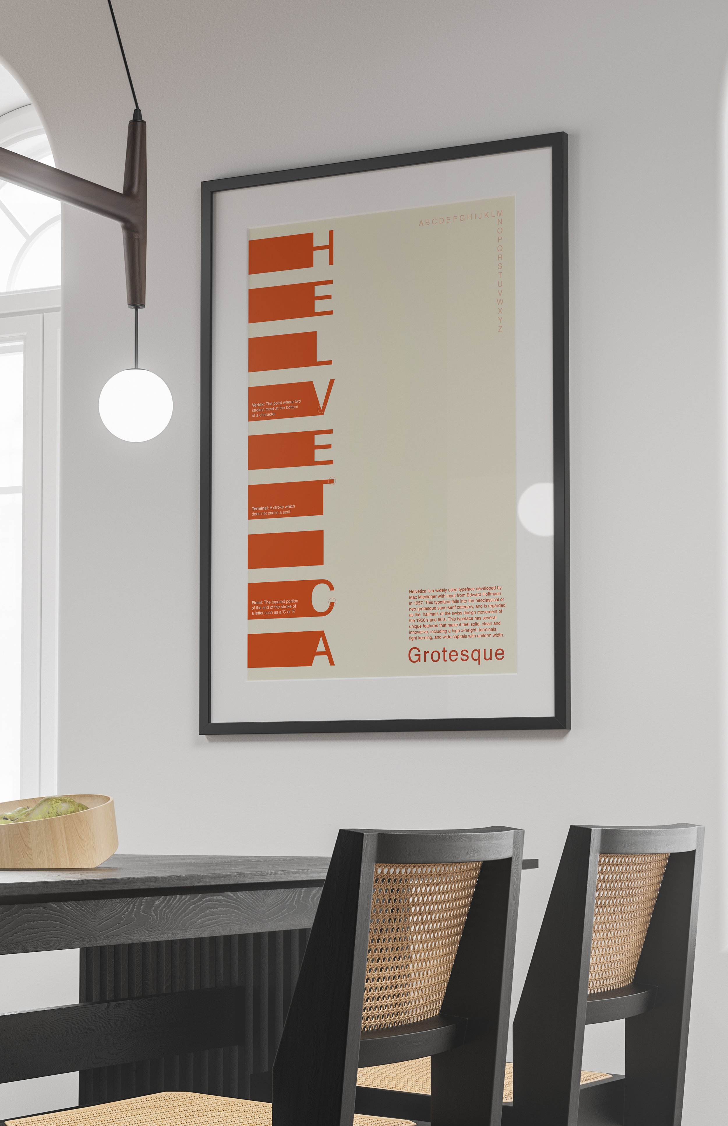
These typography classification poster designs are displayed across both museum and interior mockups to showcase intended use case.
-
A widely accepted classification system for typefaces is the vox system, which characterized typefaces into categories based on form differences and chronology. Create a striking, user-friendly type classification poster series that serves as an infographic exploration of the vox system categories, reflects the typographic landscape and provides background on the typeface and its classification.
-
Anyone who is interested in typography, the history of typefaces or enjoys bold, dynamic, graphic posters. My inspiration for this project stemmed from Bauhaus design, particularly Armin Hofmann. I wanted to re-create the feeling that some of these designs evoke, so ideally the target audience for this series would be individuals who enjoy Swiss graphic design and aesthetic.
-
The book Letter Foundation lists 9 categories—5 Serif and 4 Sans Serif - Humanist, Old Style, Transitional, Modern, Slab-Serif and Sans Serif. Utilize this information to create visually appealing, easy to understand posters that provide background on the typeface and its Vox system classification.
-
Design three 5 type classification posters in the Vox system. You will design a poster series for a combination of both serif and sans serif fonts. Your ultimate goal is to have enough information to educate the viewer on the particular category, and to reflect the typographic landscape while uniting the varying typefaces under one artistic vision. Include both serif and non-serif typefaces while creating a cohesive series.
-
I began my design process by researching all six Vox system typeface categories and selected the three fonts that I wanted to work with. I choose to include two serif typefaces (Didot and Caslon) accompanied them with three sans serifs (Helvetica, Futura and Apollo). I followed this research with sketching out several different layout ideas and then finally selected 3 to explore. I generated very rough layouts for all three different ideas for each series (15 total), and then selected my favorite concept. All of my ideas were inspired by Swiss designers, specifically Armin Hofmann, so I choose the concept that I felt looked the most Bauhausian. I then started playing with color and added in my body copy text about each typeface category and the history of each typeface.
-
In order to create a cohesive series of posters with this variety of fonts, I choose to take a Swiss design inspired approach to the layout of these posters. I wanted to keep the layout consistent and eye-catching, so I choose to include bold shapes, a small color pallet, primary colors and to play with balance by incorporating a lot of white space into my design. I also wanted to keep the focus on the title, the name of typeface, in order to draw in attention while maintaining simplicity. My goal was to emulate the feeling that is generated by popular Swiss designers through their designs by incorporating elements that represent the influence of the Bauhaus movement.