
GRAPHIC DESIGN & ART DIRECTION - BRAND IDENTITY IMPLEMENTATION & WEBSITE DESIGN
FREELANCE GRAPHIC DESIGNER – HIRED BY IRON LADLE CREATIVE ON BEHLAF OF LA BEAUTY SKIN CENTER (FULL-TIME)
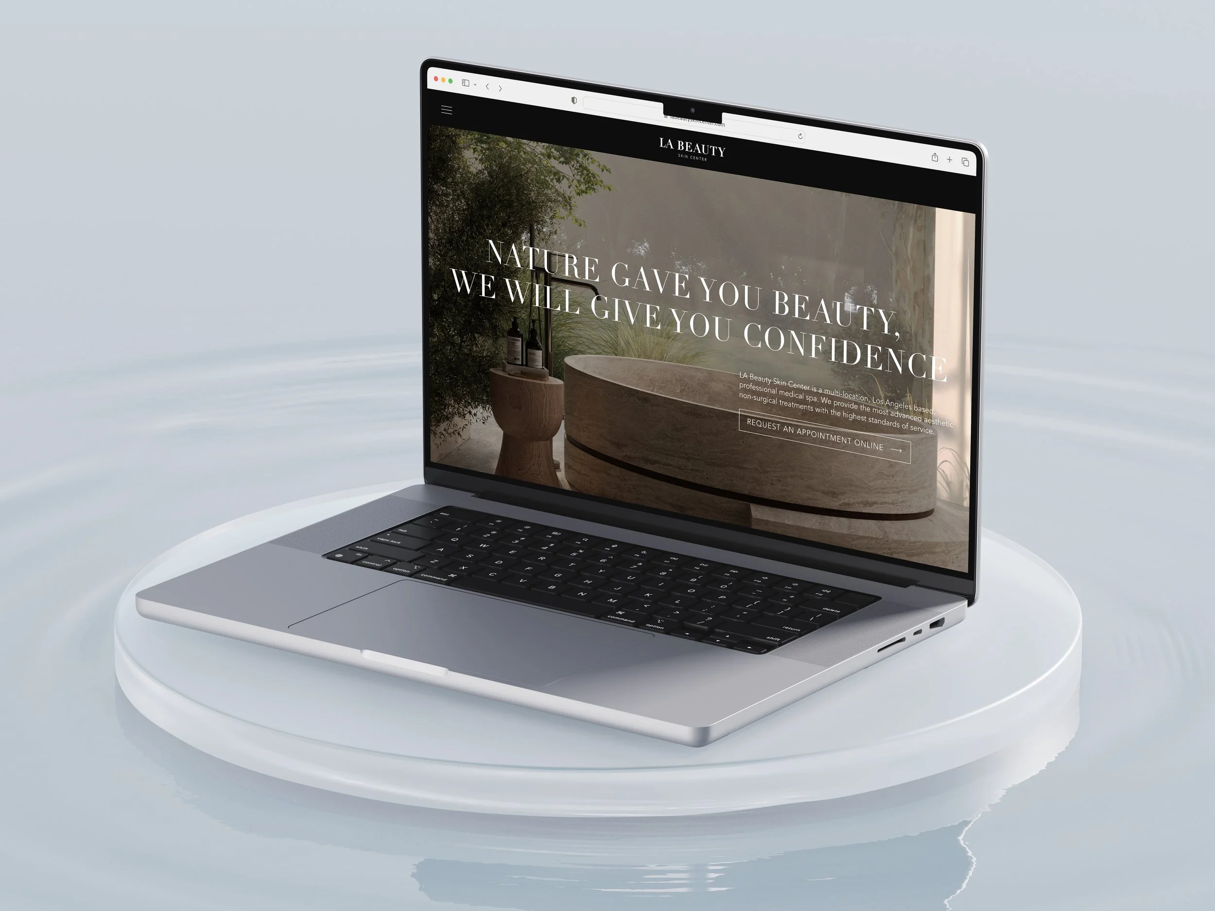
I had the opportunity to design an entirely new website for LA Beauty Skin Center, with the goal of implementing their new brand identity. This involved translating the new brand guide—which included the logo and color palette—into a cohesive and distinctive visual language. The redesigned site not only embodied / defined the updated brand identity, but reimagined the structure and user experience of the previous website. The final design elevated the brand’s positioning by reflecting its professional, refined, timeless and accomplished character through a sophisticated visual approach.
LA BEAUTY SKIN CENTER
WEBSITE DESIGN


PROJECT DETAILS
GRAPHIC DESIGN & ART DIRECTION - BRAND IDENTITY IMPLEMENTATION & WEBSITE
DEC - JAN 2024
This website was created to support the launch of the LA Beauty Skin Center refreshed brand identity & new location opening.
LA Beauty Skin Center brand identity was designed by Iron Ladle Creative*
-
La Beauty Skin Center recently underwent a re-brand in which they’ve elevated and expanded upon their previous brand identity with a new logo design, new brand guide and an upcoming additional location. This new brand identity will be conveyed and integrated across all elements of the brand, including their signage, physical locations, client communications, printed materials, marketing campaigns, and social media. A significant and essential part of this integration is the website, as it required a full re-organization and re-design in order to align with the upgraded brand identity.
-
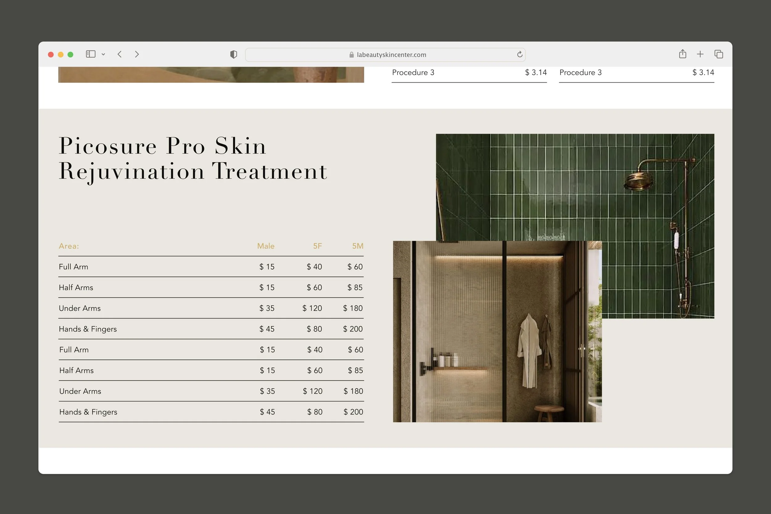
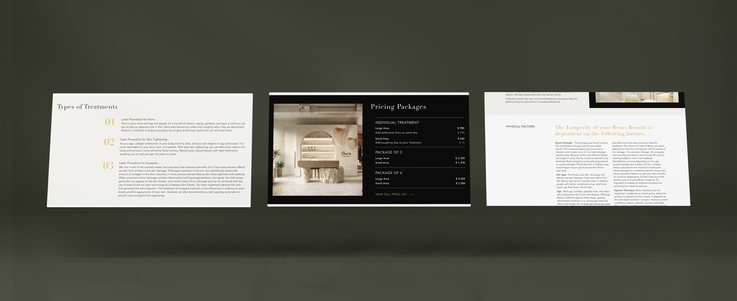
I was asked to take on this project, to create the new website design wireframes for 17+ induvial web pages for both desktop and mobile devices. The intention of the project is to create a new website design that is cohesive and representative of the updated brand identity, while remaining innovative and expanding upon these concepts. The challenge was to execute this project in five weeks, with the goal of elevating the business as a whole by leveraging their most vital client communication touchpoint, their website.
-
Women ages 25+ who are looking to improve their appearance, have disposable income, flexible schedules and live within range of Los Angeles, CA. Due to the high value of patient retention rates in this industry, it’s important to continue to market toward the pre-existing customer base in order to retain their business in a growingly competitive industry.
-
The previous website for LA Beauty skin center was out of date and did not align with the new brand identity. In order to tackle this project, I had to translate this content into a user-friendly, simple and intuitive structure before designing the communications in a way that complimented and expanded upon the new brand identity, while providing an innovative and calming user experience that is enticing and educational. A lot of the business and appointment booking is completed online, so it is essential that the website evokes the same elevated, elegant, chic and professional sentiments that are conveyed through the rest of the brand identity in order to keep patient retention high and draw in new customers in a growing market.
-
Design a full website for LA Beauty that both represents and expands upon the new upgraded brand identity, while simultaneously re-conceptualizing the pre-existing website. The design should emphasize and evoke the professional, refined, timeless, glamorous and accomplished nature of the industry.
-
In order to create a website that both reflected the new brand identity and expanded upon the potential that the guide provided, I placed my focus on typography, layout, cohesion, consistency and flow. I was able to utilize my background in psychology and understanding of instinctual cognitive processes to create a user-friendly, simple, concise website and directory structure that facilitates ease of comprehension.
-
The final website designs utilize simplicity in both color palette and layouts in order to present the information in an aesthetically pleasing, clean, professional, chic, innovative and elegant manner. The use of the beige/ sand tone as a compliment to the black and white stripes provided a slightly softer, warmer edge to the design. This element also plays with the gold accent color and warm undertones of the photography in order to evoke a less conventional and stark sentiment. I curated the photo selection that appears on the website mockups to serve as a guide for LA Beauty’s photographer to utilize when shooting all of the new location imagery. The new location photography is being composed simultaneously to the development of this website. This will facilitate a website launch with updated / accurate imagery that reflects this new curated lighting, tone, energy, texture, and scale. The dynamic elements and animations were utilized to add emphasis to specific layouts, create visual interest, and guide the users eye intentionally.
< PREVIOUS